Skip to content

Soft Water

Brand & Design · Posters · Animation

Soft Water Hard Stone

This project was for a graphic design class where students spent the semester working on a rebrand for an art show of our choice. I chose the 2021 New Museum Triennial Soft Water Hard Stone, which focused on the effect human persistence can have on a large problem during the recent pandemic.

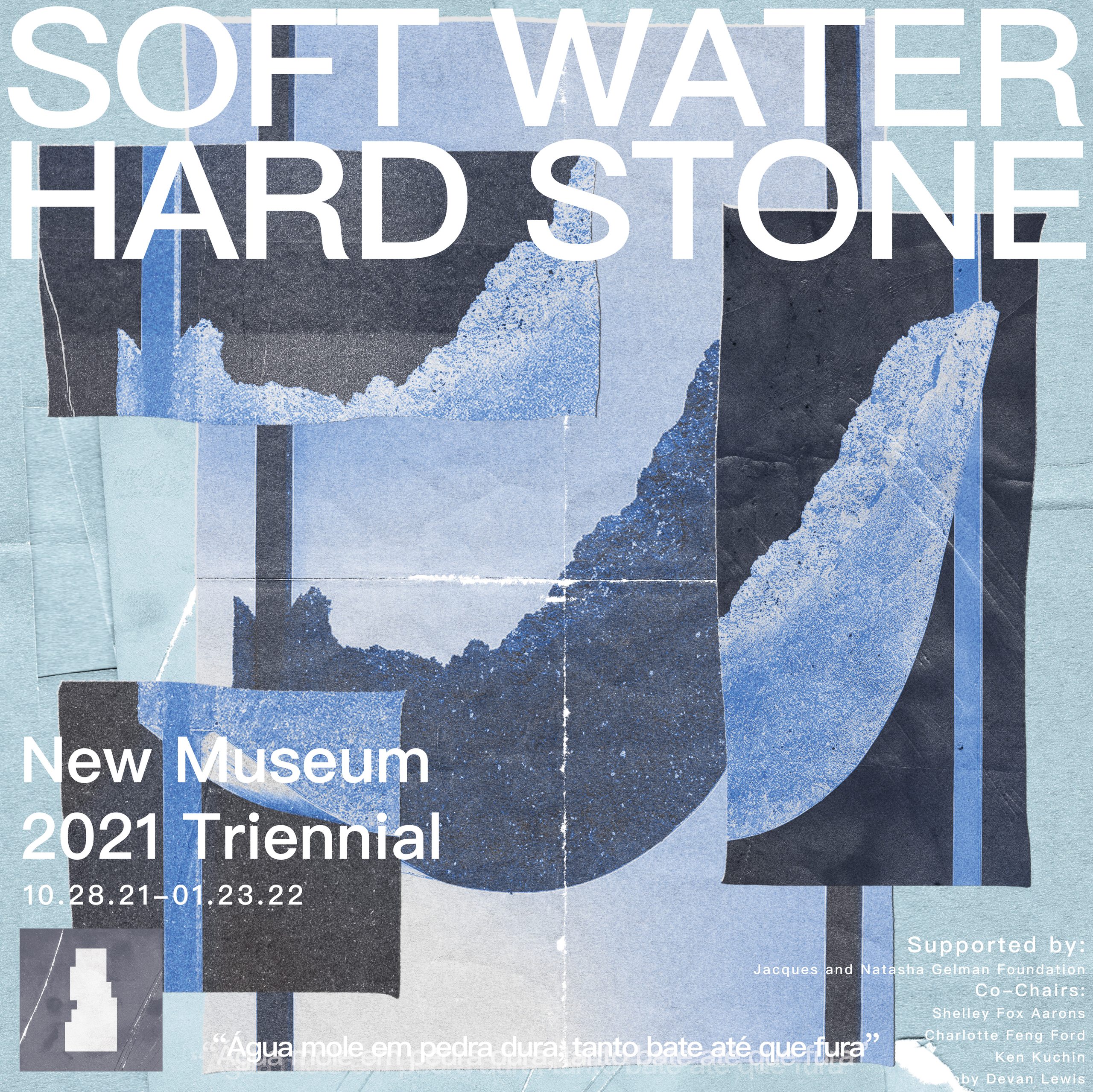

The poster project was supposed to help students find their theme for the rest of the semester. By making a handful of posters in dIfferent themes, the goal was to have students explore a diverse group of aesthetics to continue working with for the rest of the semester. My initial poster iterations were made in illustrator and were relatively simple, utilizing unedited versions of works featured in the show. I eventually decided to stray further from the minimalist designs the show already employed and explore texturing and color manipulation in Photoshop to make a ripped paper scrapbook theme. I wanted to make a poster that represented the theme of progress and degradation over time that the show was curated around. I thought that fragmenting an image of an artwork could represent both the ideas of construction and breakdown that the show’s artists grapple with. I combined this texture with blue gradient mapping to stick with the theme of life being fluid like water that the shows pieces comment on.

Posters Prototypes
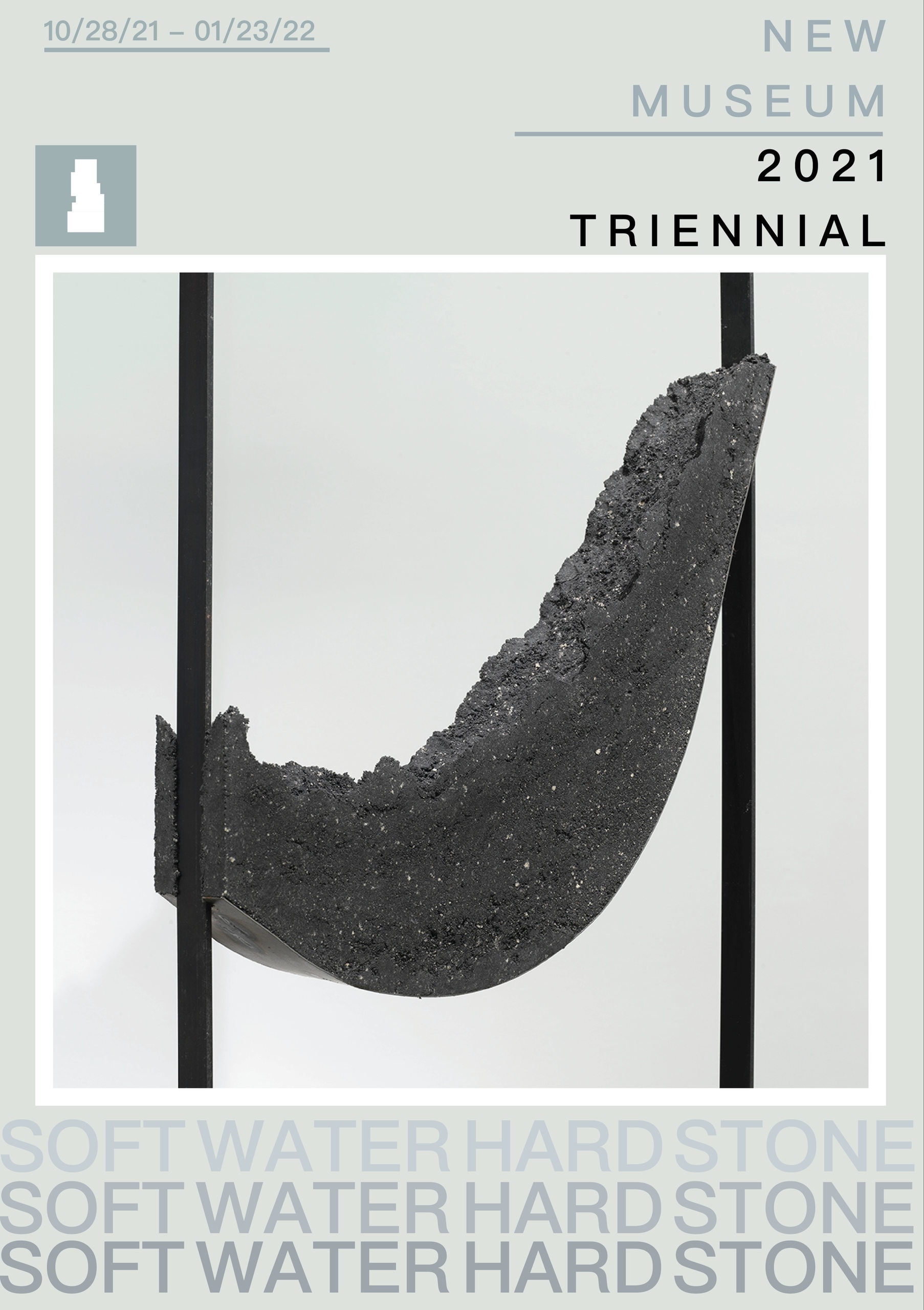
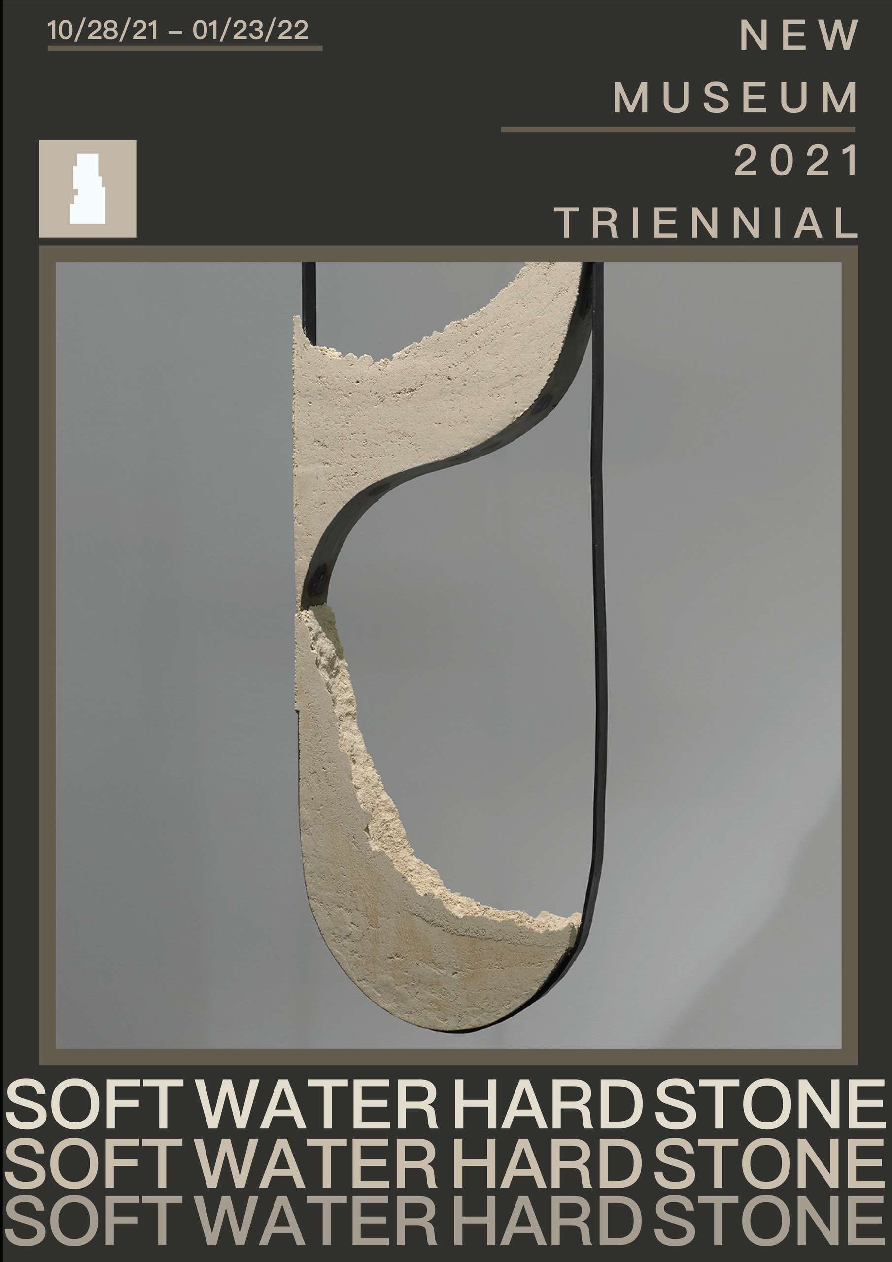
A grey poster for the New Museum 2021 Triennial: a dark curved sculptural form suspended between two vertical bars, with “SOFT WATER HARD STONE” repeated in stacked lines across the lower third.
A dark olive poster for the New Museum 2021 Triennial: a pale sand-and-metal form hanging inside a bordered frame, the run 10/28/21 – 01/23/22 ruled across the top left, and “SOFT WATER HARD STONE” set three times in stacked lines along the bottom.
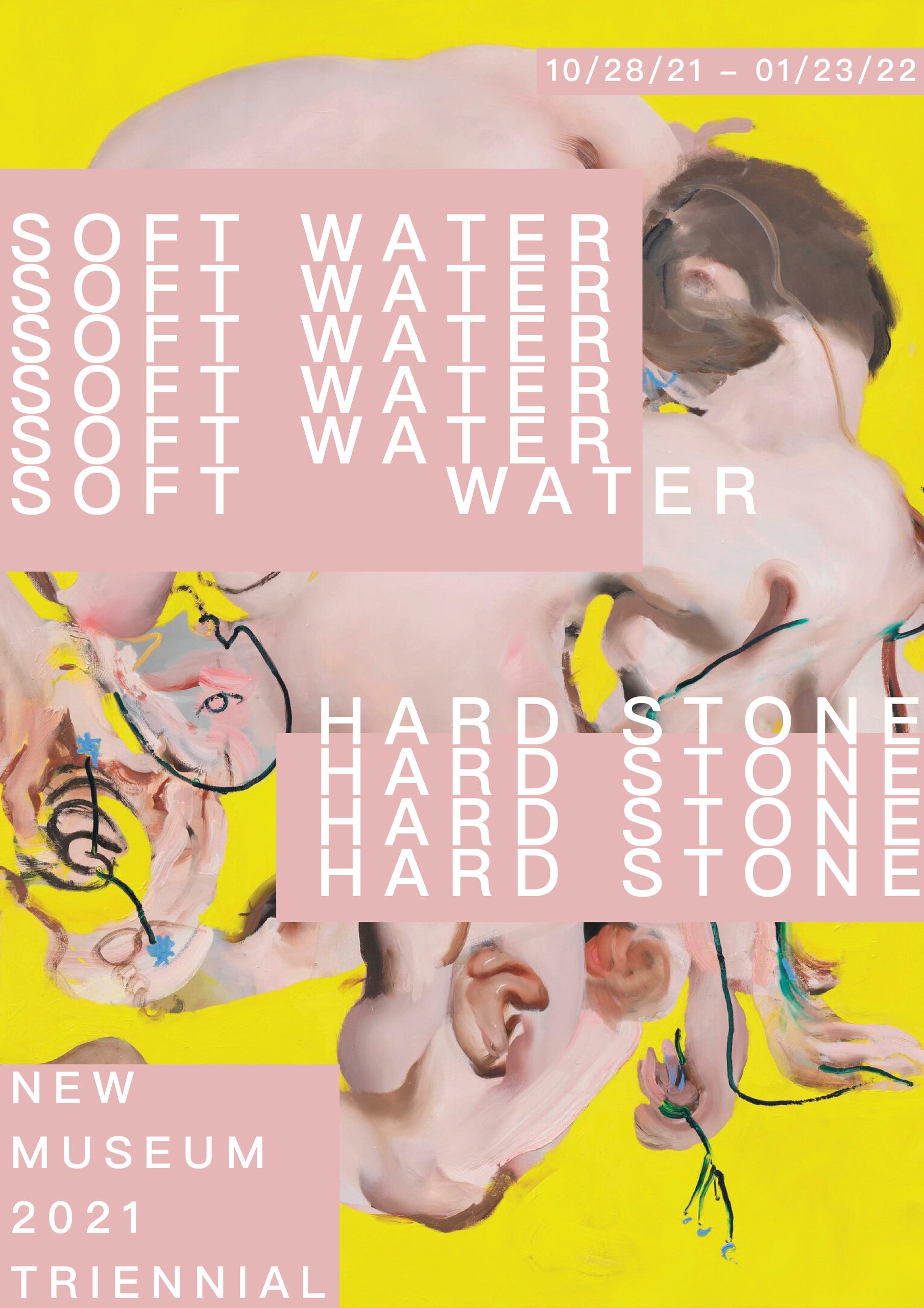
A yellow poster with “SOFT WATER” and “HARD STONE” repeated in overlapping pink and white lines over a collaged pink figure, with “New Museum 2021 Triennial” set small at the lower left.
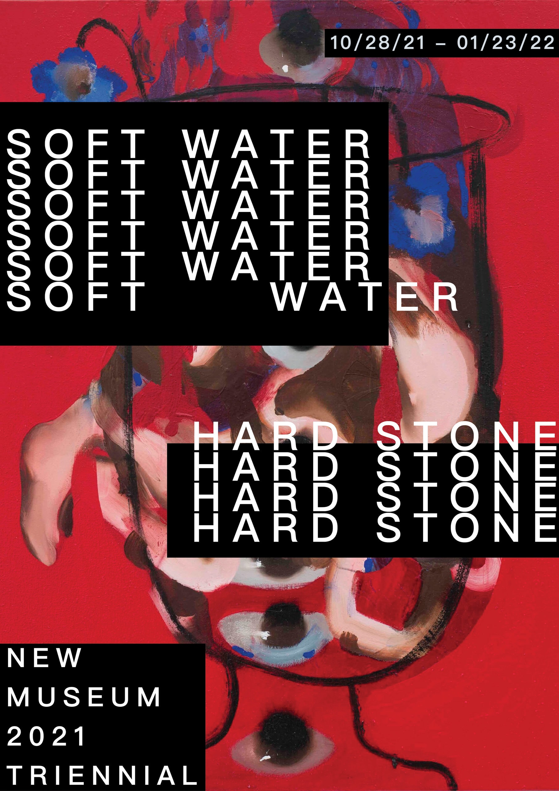
A red poster with “SOFT WATER” and “HARD STONE” repeated in black and white stacked type over a collaged face, with the New Museum Triennial credit in a black block at the lower left.

Final Poster

A poster reading “SOFT WATER HARD STONE — New Museum 2021 Triennial, 10.28.21–01.23.22” in large white type, laid over overlapping blue and black collage panels of stone-like textures.

The next assignment for the class tasked students to make an animated version of the final poster for advertising. Using AfterEffects, I chose to make an instagram ad since my poster was already square and would translate well to the phone format. Drawing inspiration from the show’s message that everything is always in a state of change, I chose to make the background a flip book effect with various cutouts. I also wanted the text flicker on and off like old lights because it had a worn down look that embodied many of the pieces shown.

Animated Poster
The Instagram advertisement, animated: a square torn-paper collage in blues and charcoal whose pieces shift while the Portuguese proverb “Água mole em pedra dura, tanto bate até que fura” slides across the top, “New Museum 2021 Trienial” and the run Oct. 21 2021 – Jan. 23 2022 wipe in, then “Soft Water Hard Stone” takes the middle before the type clears and it starts again.

The third project was to make a mock publication for the show using InDesign. We were asked to make a publication that featured our favorite pieces from the show. For this assignment I had to veer slightly from my paper cutout theme I had been following up until now because it was becoming too complicated and confusing to theme each page. I instead opted to stick to that design language for only the cover and table of contents, the rest of the book employed a more simple and clean look akin to my earlier designs since it was clearer for readers.

Publication
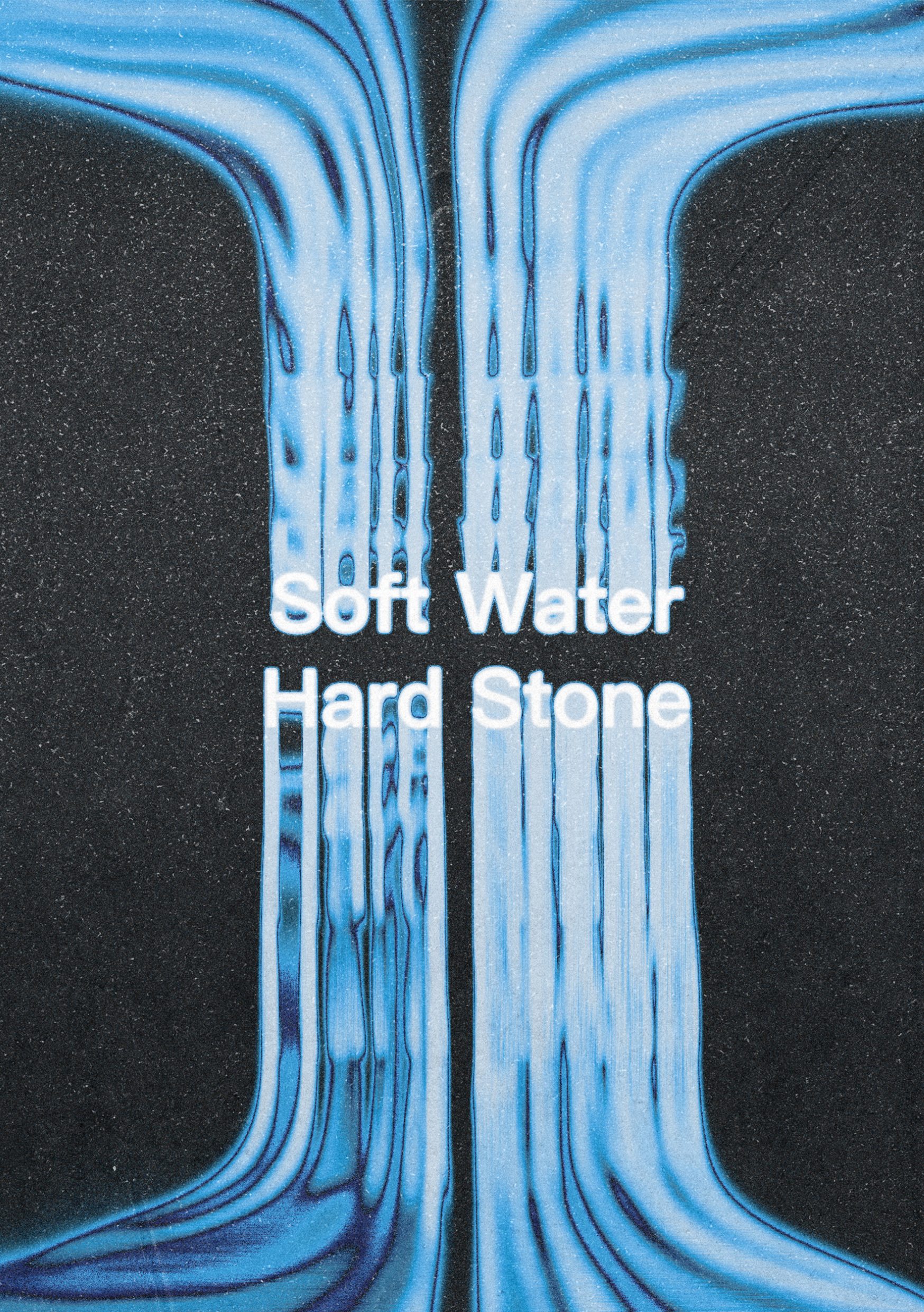
The exhibition catalogue cover: “Soft Water Hard Stone” in white type over a bright blue field of vertical flowing lines against dark grain.
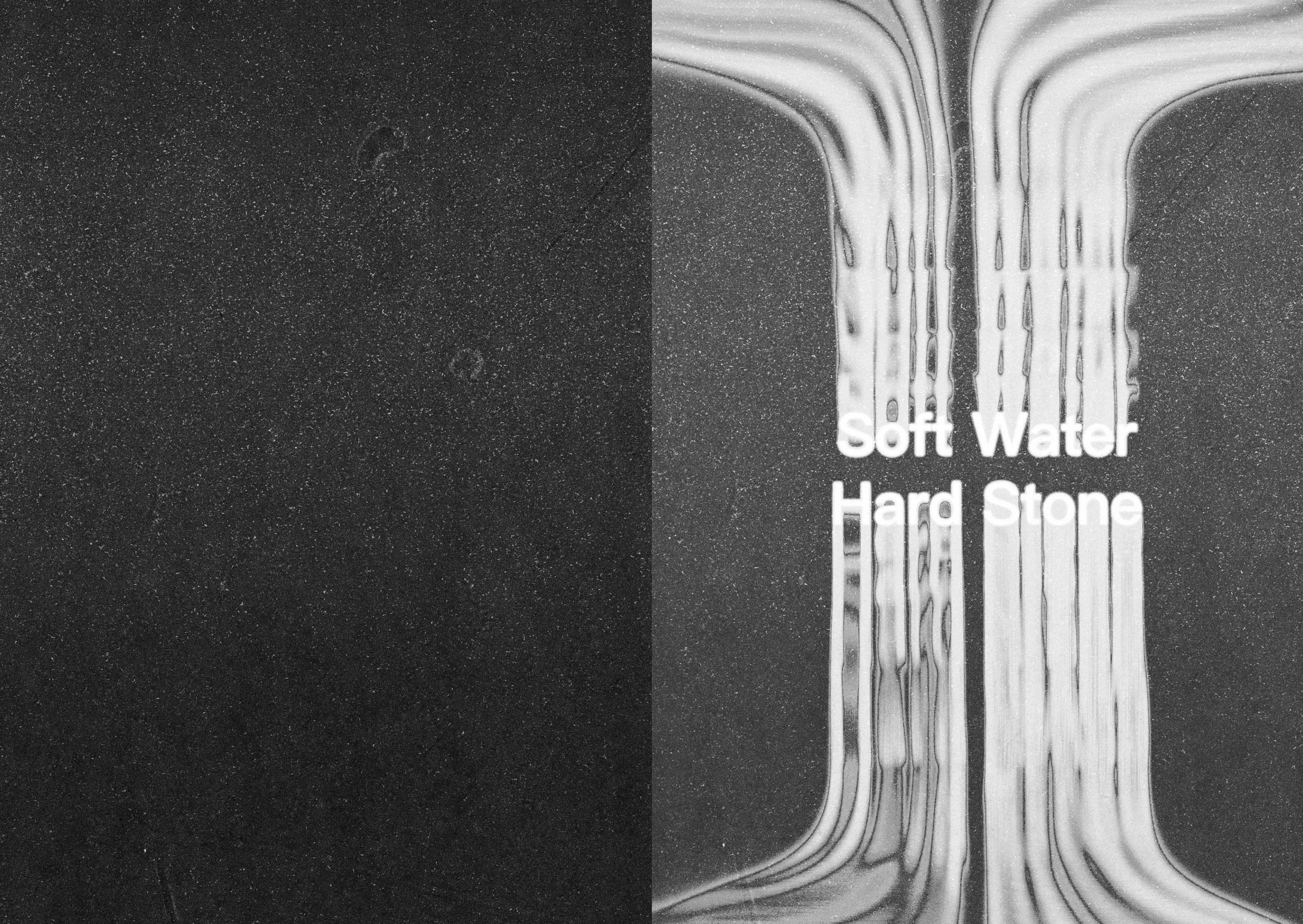
The catalogue's title spread: a black speckled page on the left, and on the right a black-and-white photograph of the poured, dripping form used throughout the identity, with “Soft Water Hard Stone” set small and white over it.
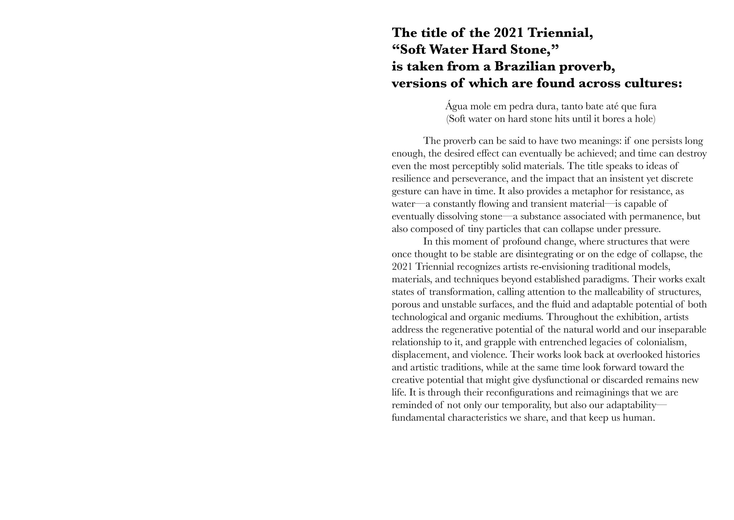
An introductory catalogue spread explaining that the title of the 2021 Triennial is taken from a Brazilian proverb — “Água mole em pedra dura, tanto bate até que fura” — with the essay text set in a single justified column on the right.
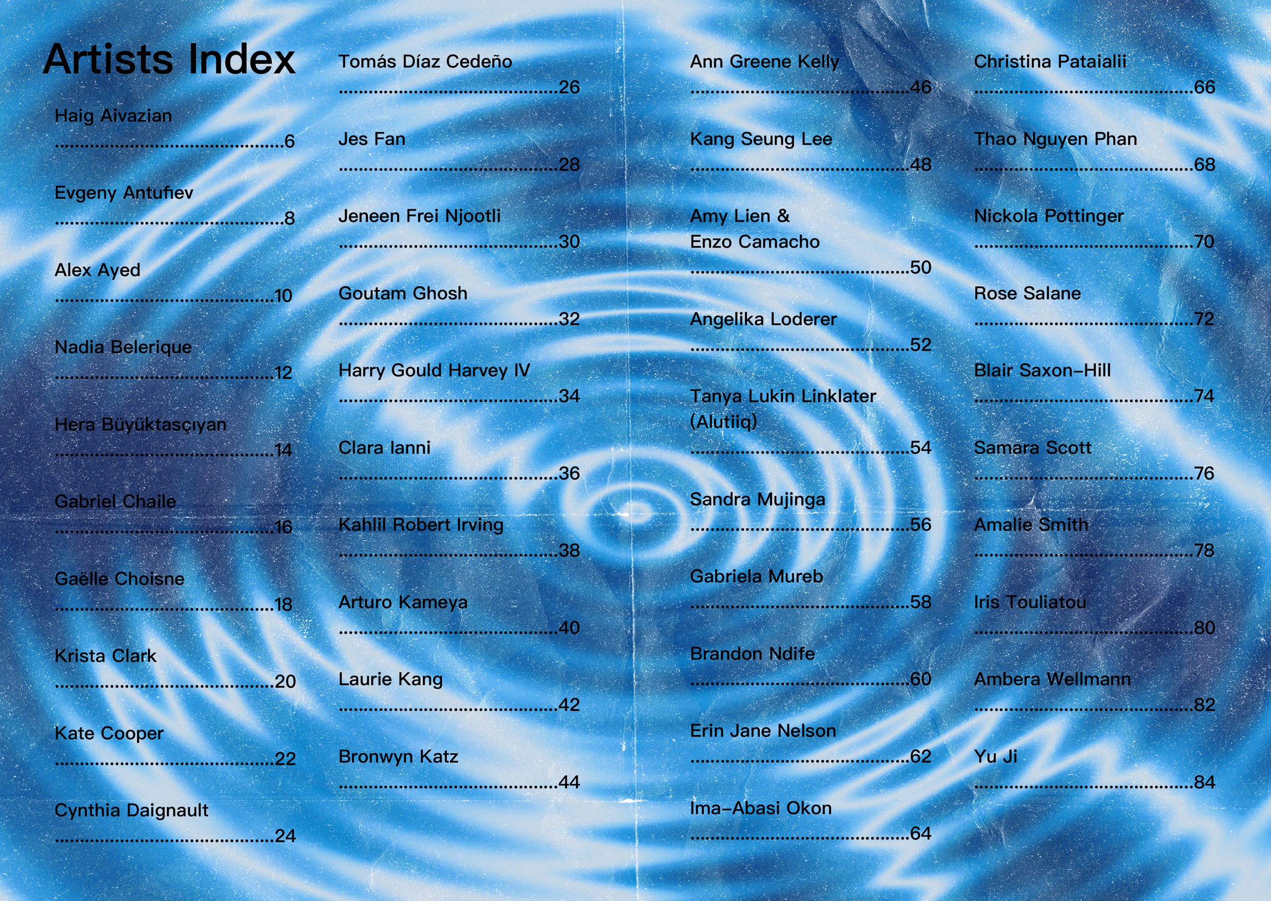
The catalogue’s Artists Index spread: three columns of artist names with page numbers, set in white over a rippling blue water pattern.
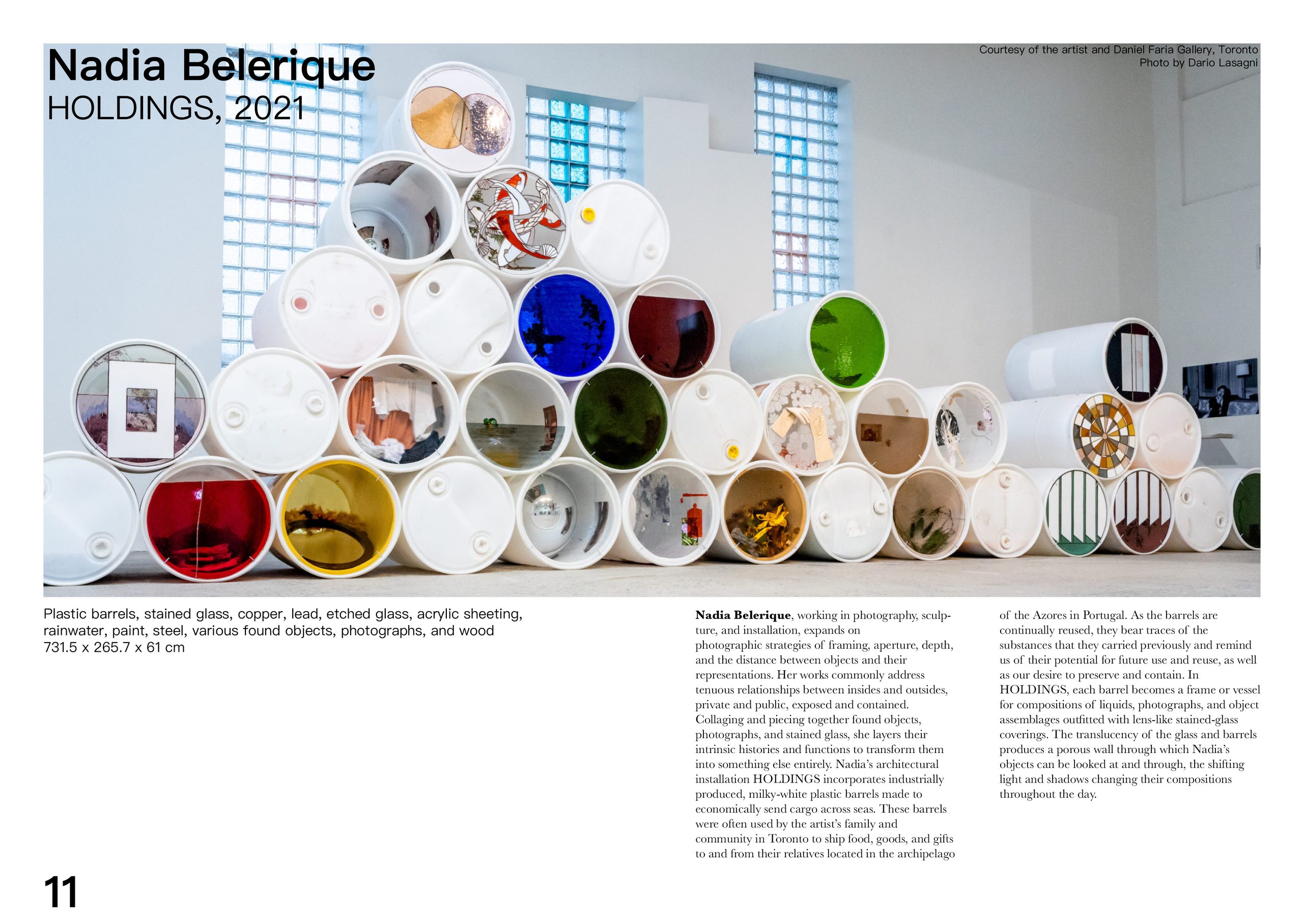
A catalogue spread for Nadia Belerique’s “HOLDINGS, 2021”, showing a photograph of stacked open-ended plastic barrels filled with found objects, with the caption and essay text set in columns alongside.
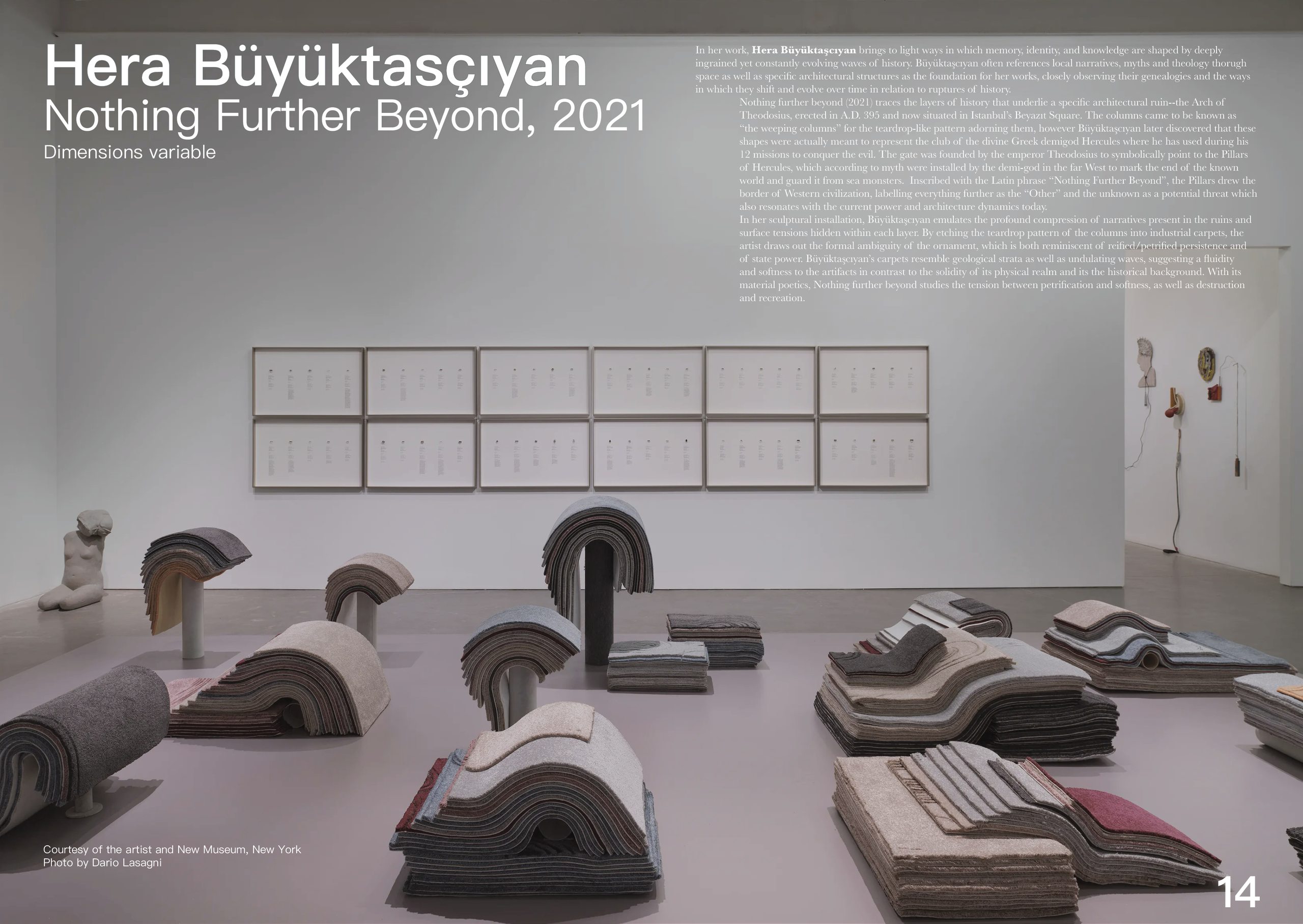
A catalogue spread for Hera Büyüktasçıyan’s “Nothing Further Beyond, 2021”, showing an installation of rolled and stacked carpets arranged on a gallery floor beneath a grid of framed works.
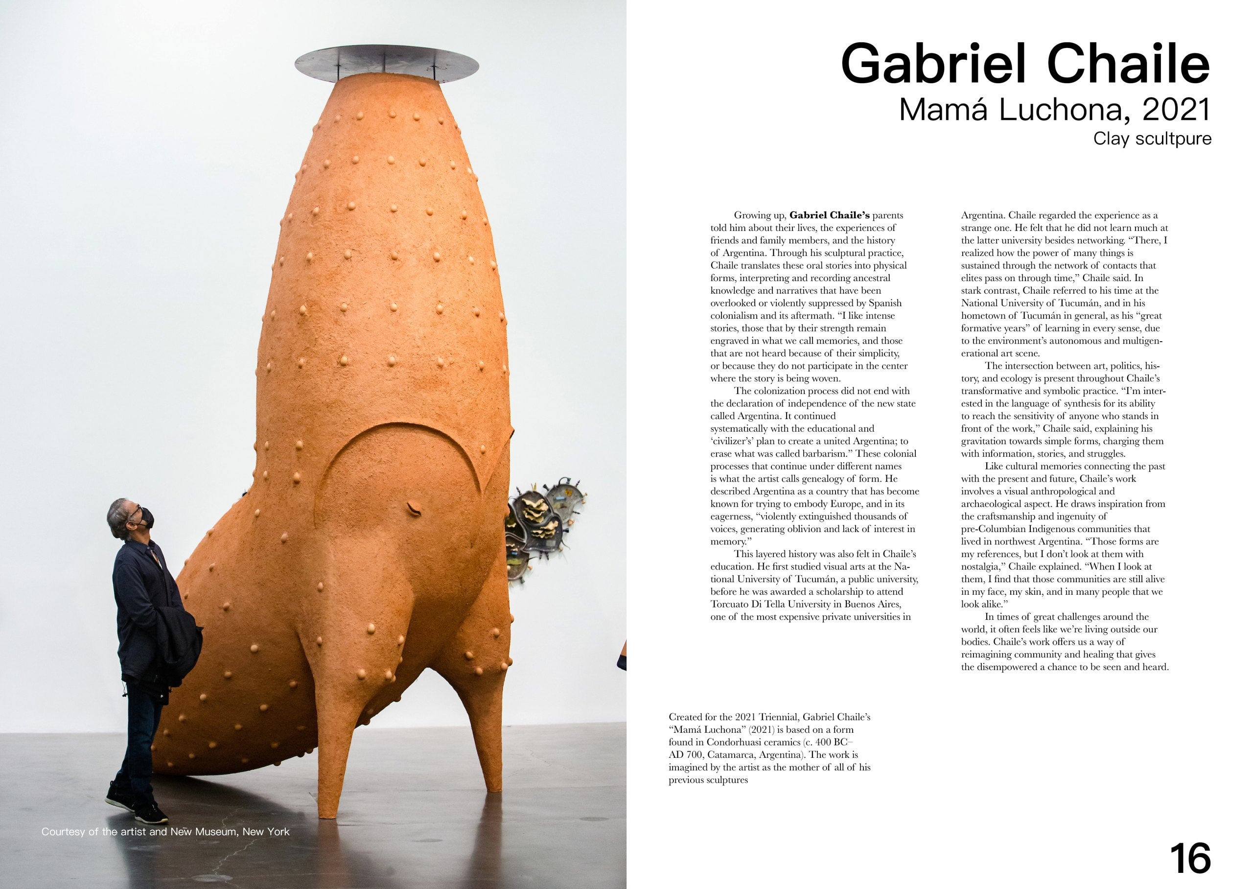
The Gabriel Chaile spread, page 16: a full-height photograph of “Mamá Luchona” (2021), a tall studded terracotta vessel standing on legs with a visitor looking up at it, facing two columns on Chaile's translation of family stories into sculpture.
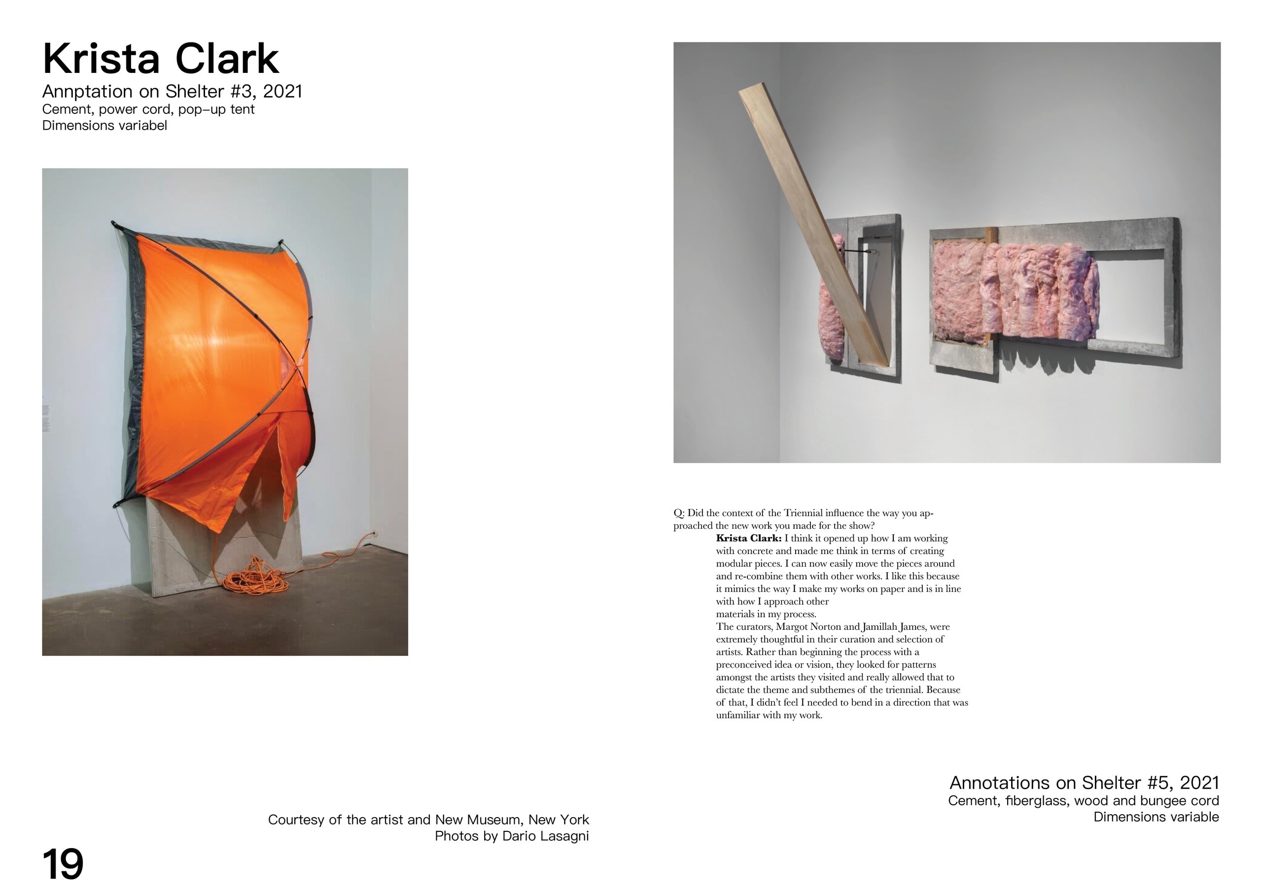
The Krista Clark spread, page 19: “Annptation on Shelter #3” (2021), an orange pop-up tent collapsed over a cement block with its power cord coiled on the floor, above a photograph of “Annotations on Shelter #5” in cement, fibreglass and pink insulation, and a Q&A with the artist.
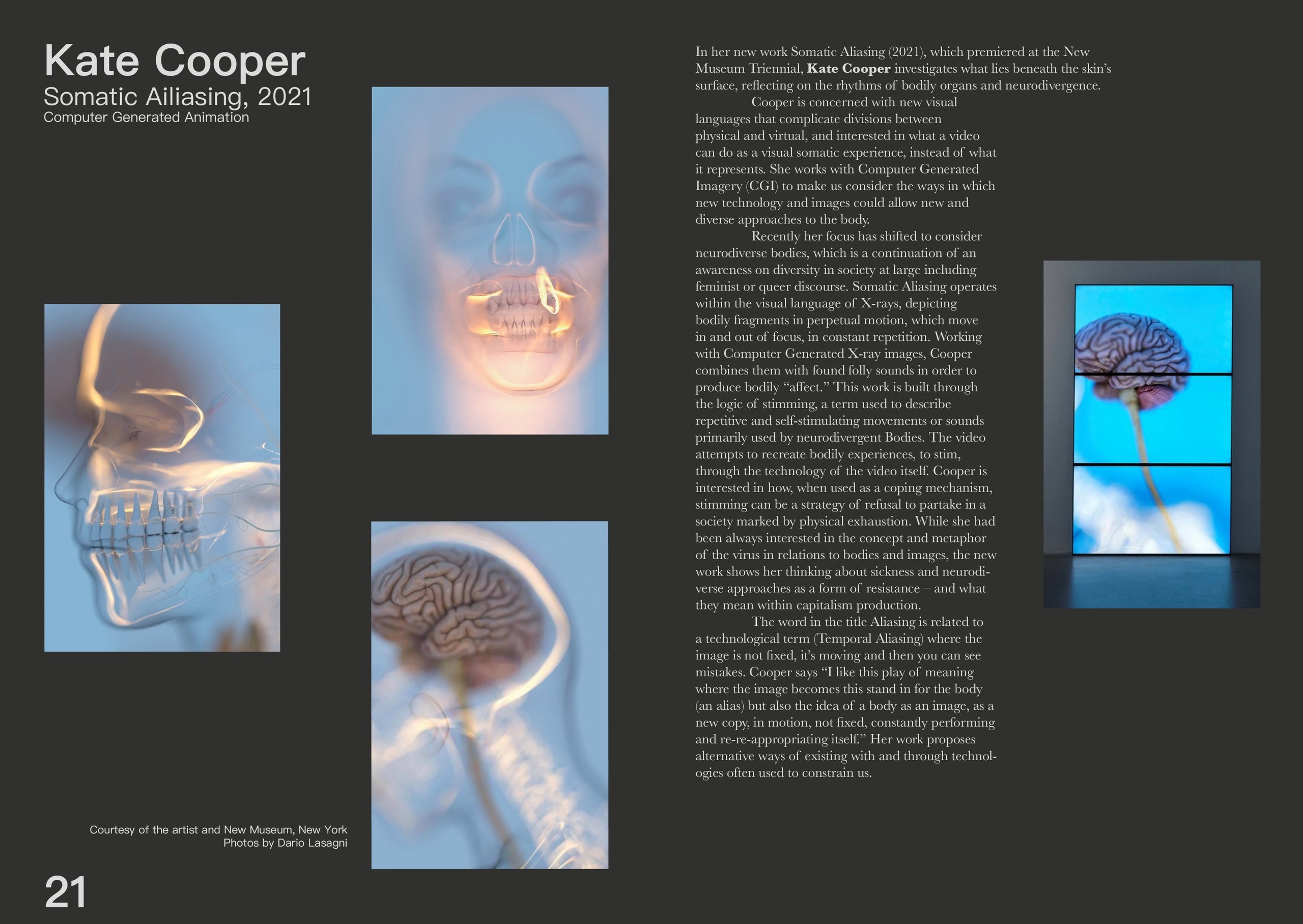
The Kate Cooper spread, page 21, set on charcoal: three computer-generated X-ray stills from “Somatic Ailiasing” (2021) showing a skull in profile, a jaw and a brain on its stem, a fourth shown on a stacked three-panel screen, and an essay on her work with CGI bodies.
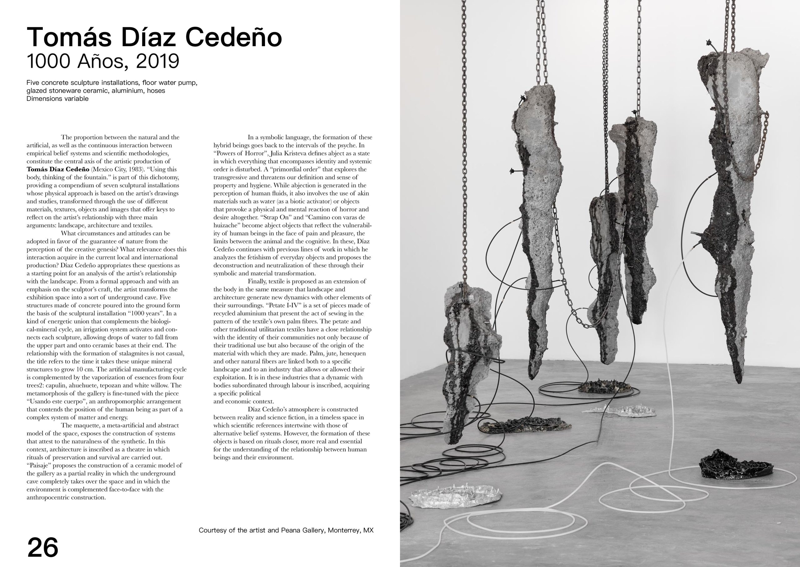
The Tomás Díaz Cedeño spread, page 26: “1000 Años” (2019), rough concrete slabs hung on chains above a gallery floor strung with black and white hoses and small metal trays, beside four columns of text.
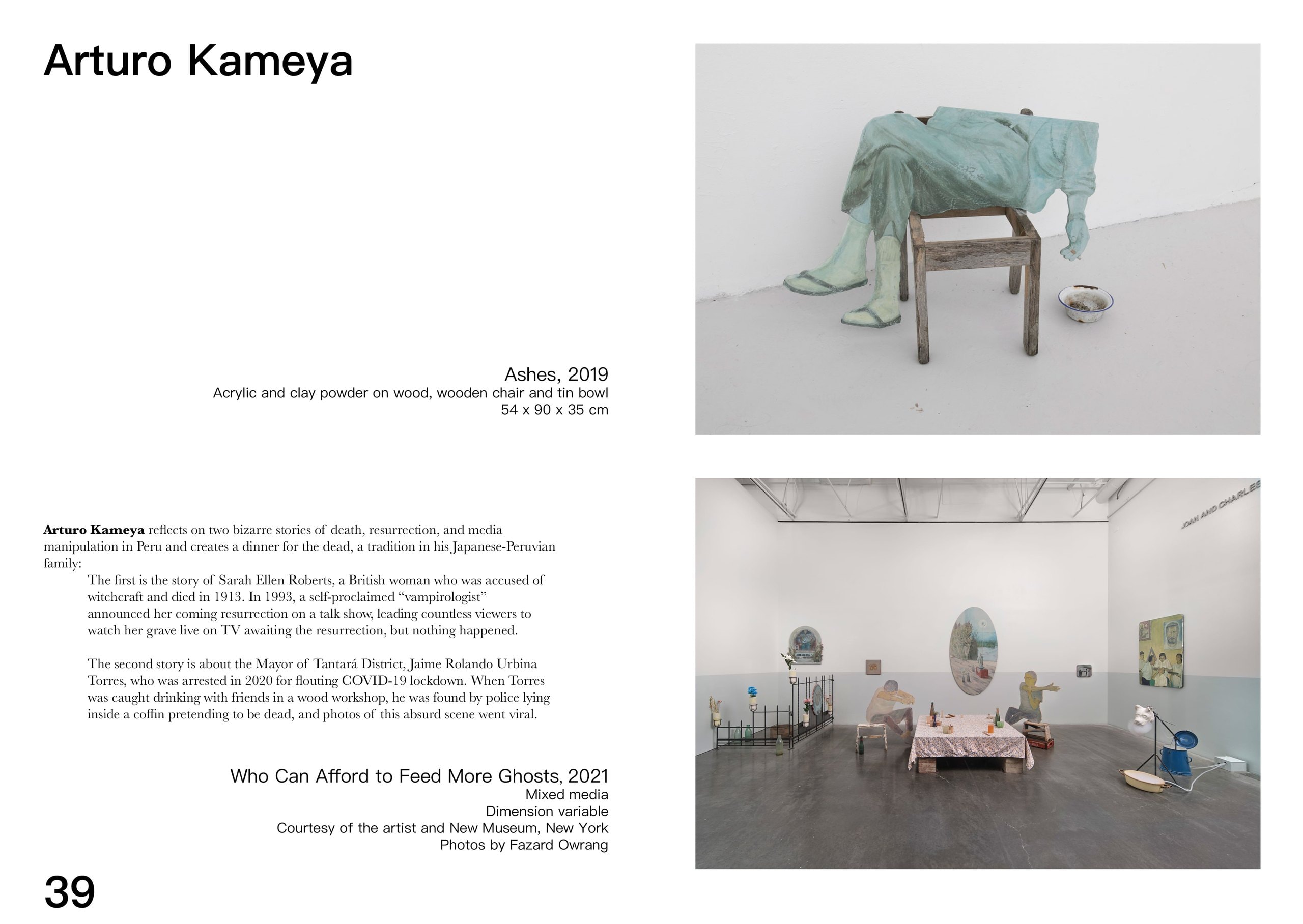
The Arturo Kameya spread, page 39: “Ashes” (2019), a pale green clay-powder figure slumped over a wooden chair beside an enamel bowl, above an installation view of “Who Can Afford to Feed More Ghosts” (2021) with a laid dinner table set among painted cut-outs.
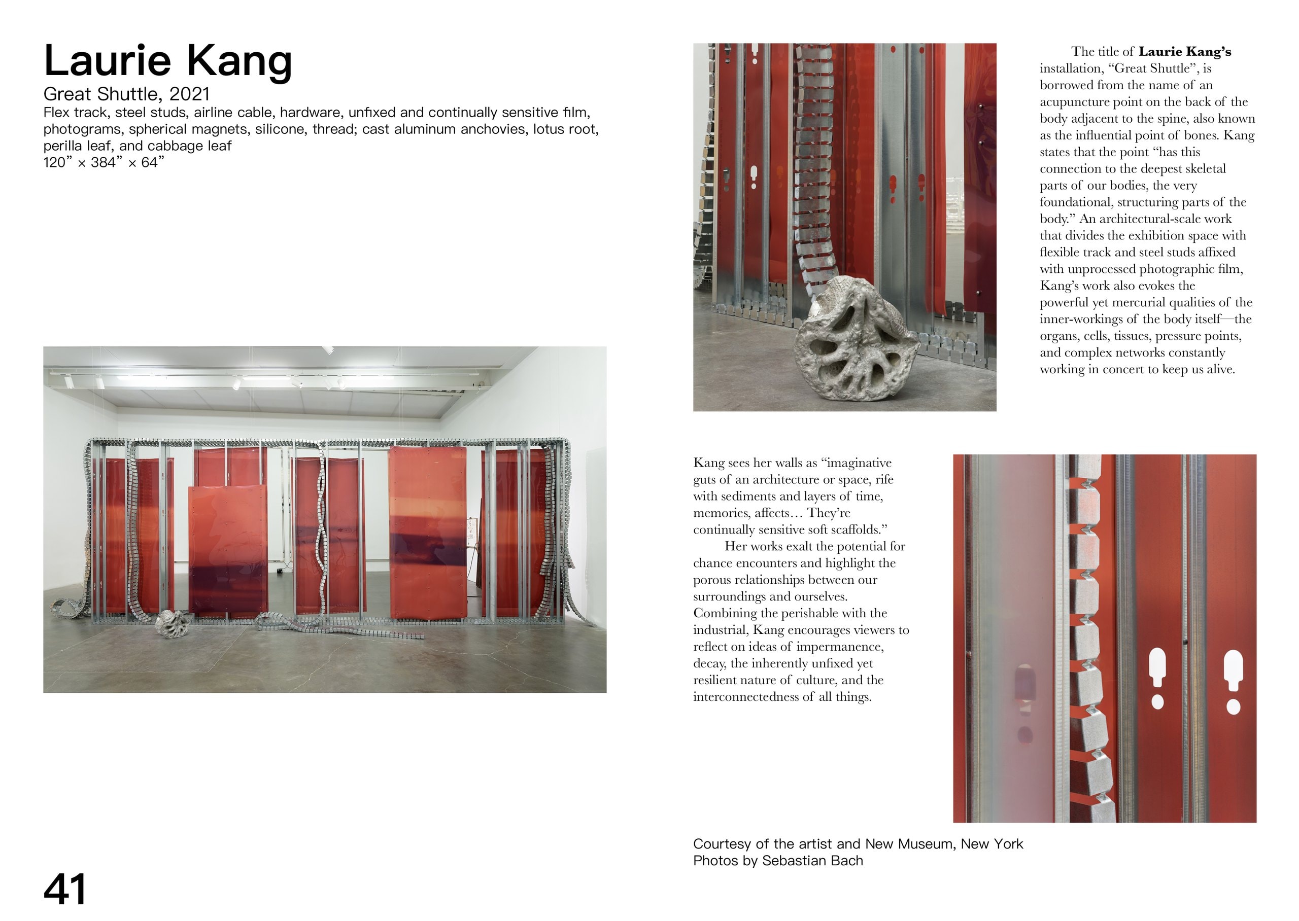
The Laurie Kang spread, page 41: “Great Shuttle” (2021), red translucent film panels held upright in steel studs across a gallery, with two detail photographs and an essay on the acupuncture point the title borrows its name from.
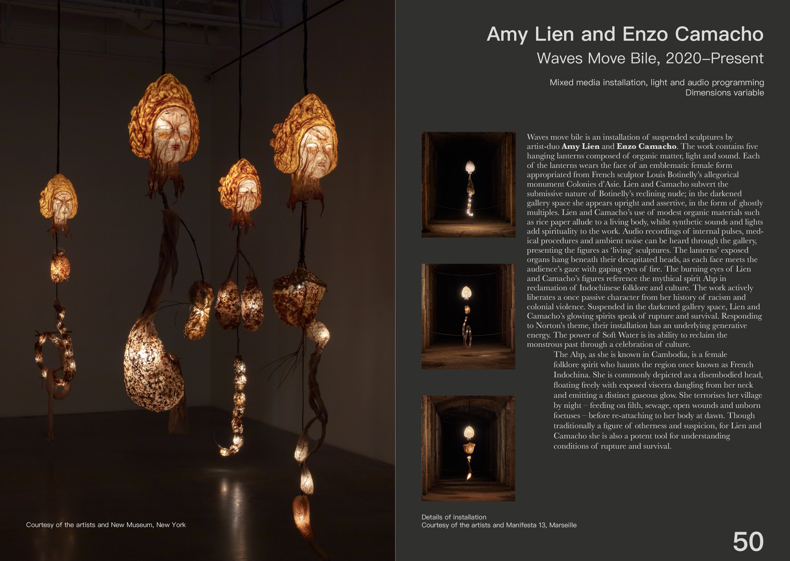
The Amy Lien and Enzo Camacho spread, page 50: “Waves Move Bile”, glowing lantern-heads with painted faces suspended in a dark gallery on the left, and on the right three small corridor views beside an essay on the Ahp, the folklore spirit the figures reclaim.
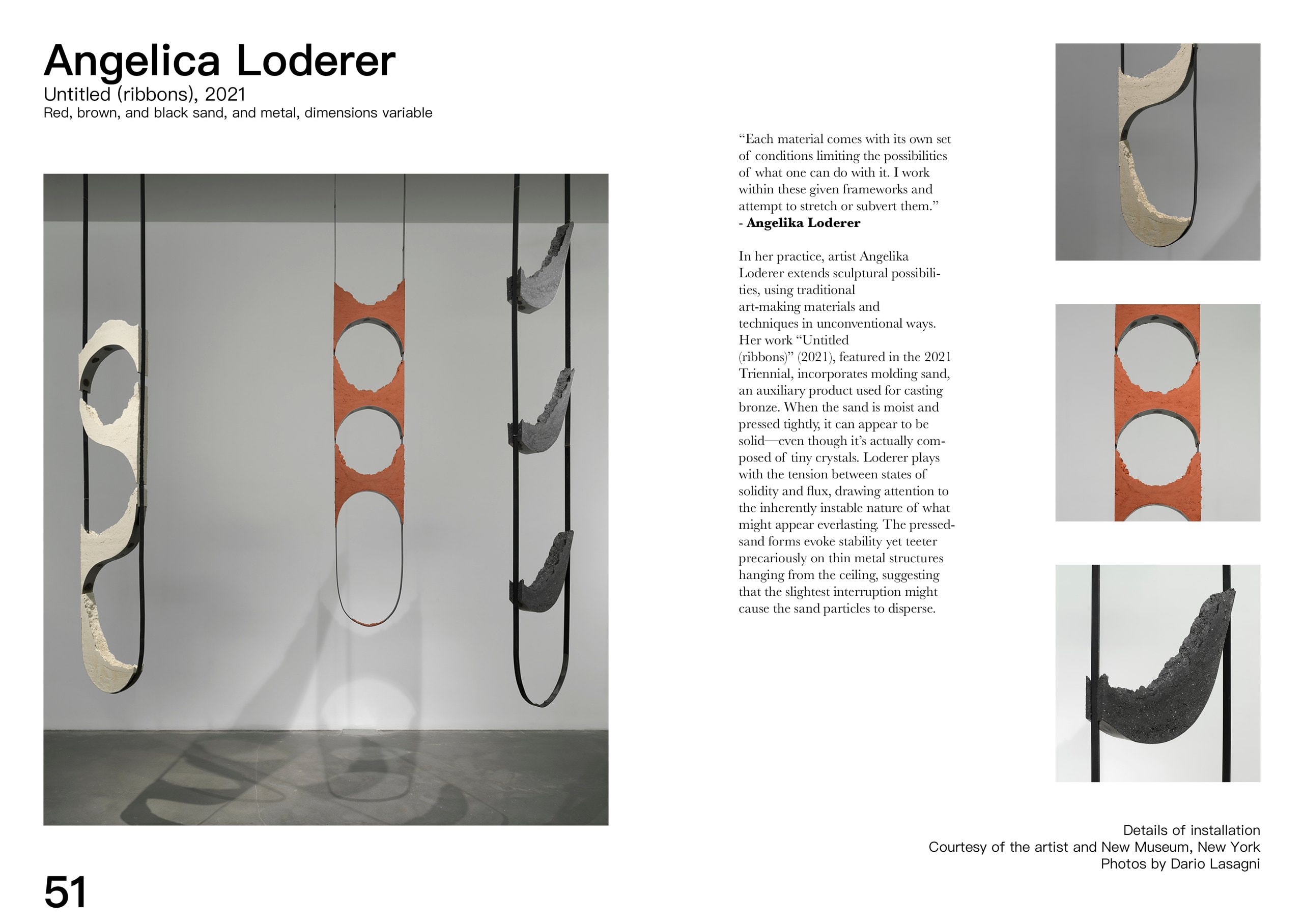
The Angelica Loderer spread, page 51: “Untitled (ribbons)” (2021), three pressed-sand ribbons in cream, terracotta and black balanced in thin metal loops hanging from the ceiling, with three detail photographs stacked down the right edge.
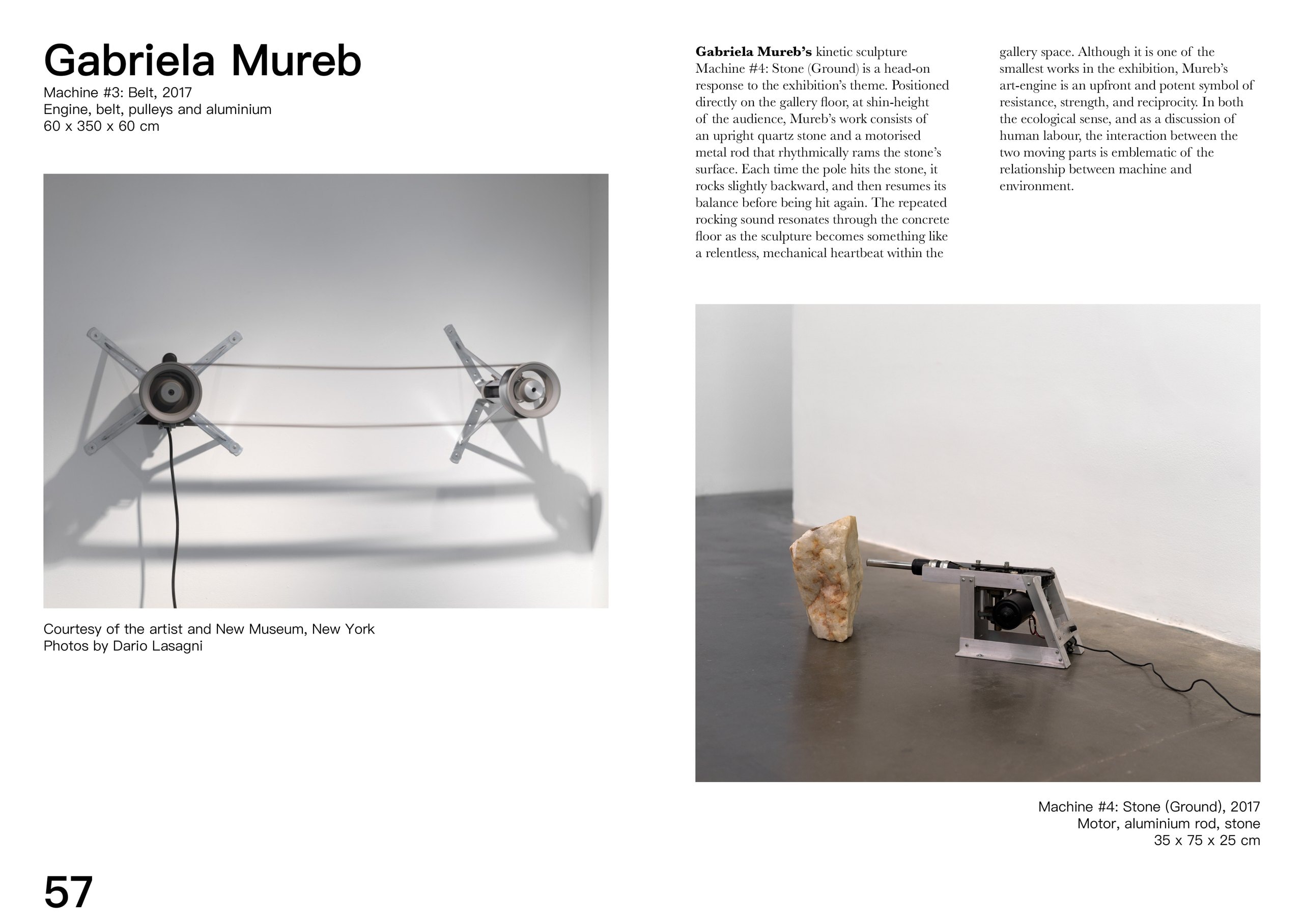
The Gabriela Mureb spread, page 57: “Machine #3: Belt” (2017), an engine and two pulleys strung with a belt against a white wall, above “Machine #4: Stone (Ground)”, a motorised aluminium rod set on the floor to knock repeatedly against an upright quartz stone.
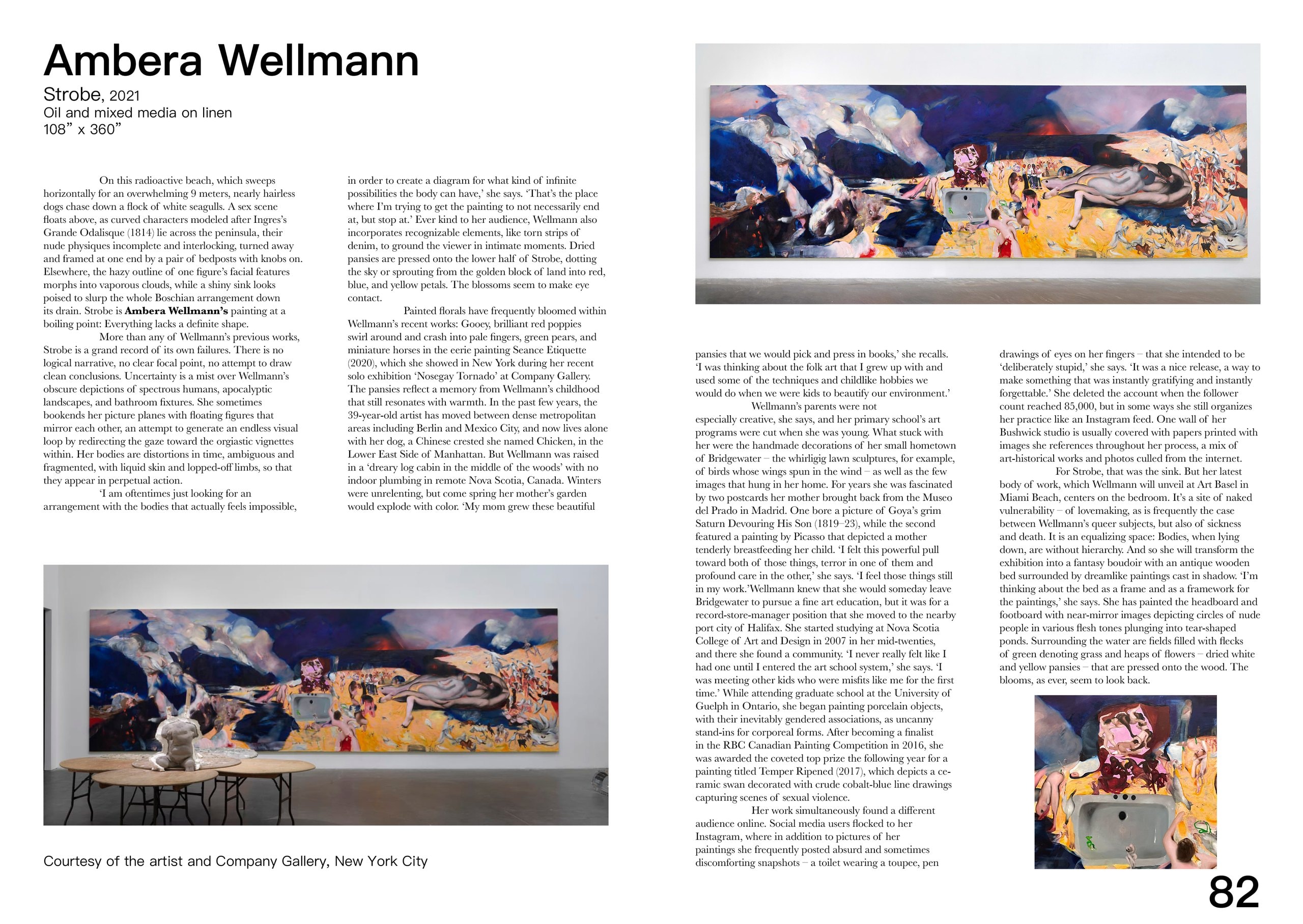
The Ambera Wellmann spread, page 82: “Strobe” (2021), a nine-metre oil painting of tangled nude figures in blue, yellow and pink shown hung above a low table and again full-width at the top, with four columns on the painting and a detail of the sink at its centre.
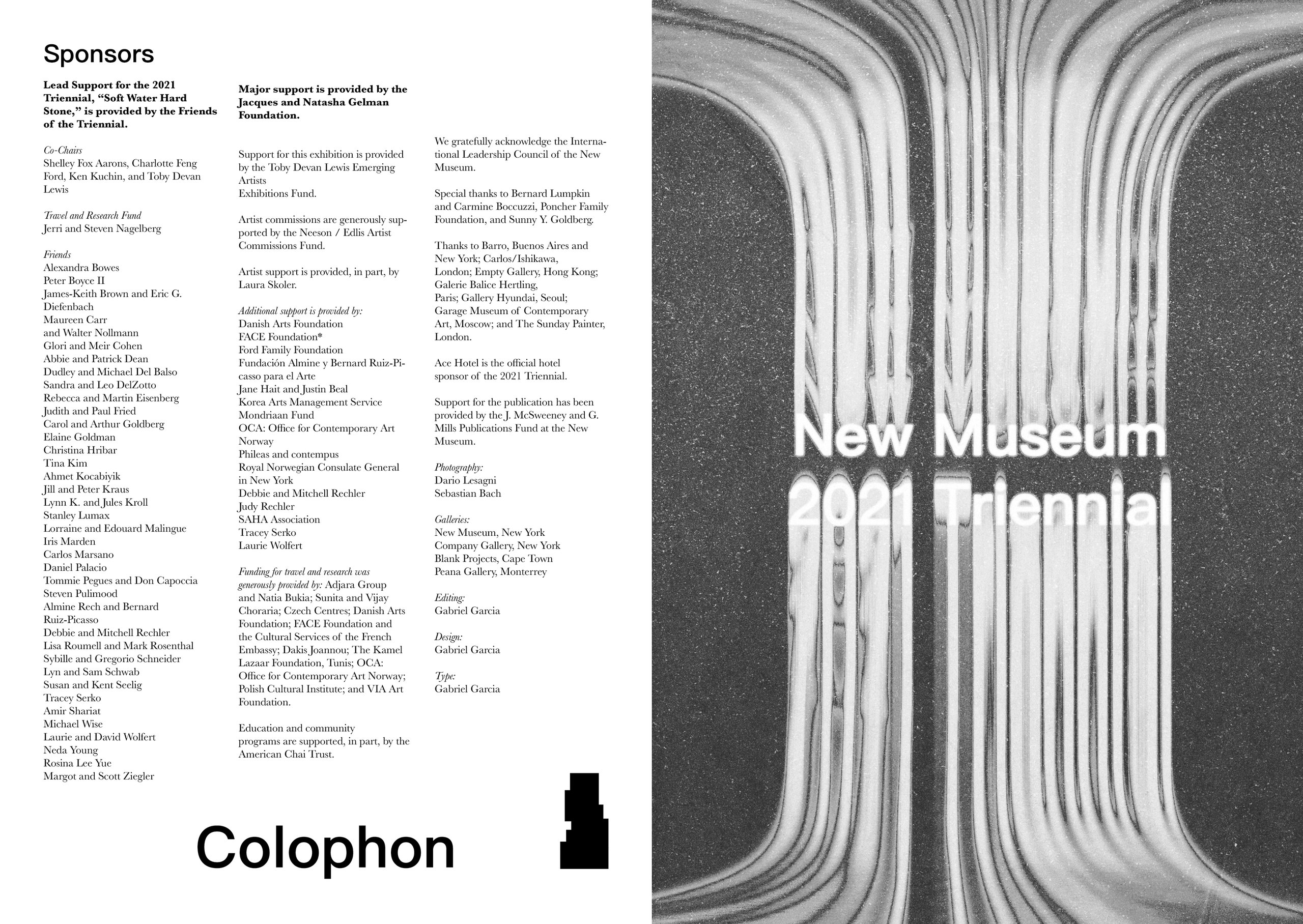
The colophon spread: sponsors, co-chairs and the Friends of the Triennial listed in three columns under a large “Colophon”, facing a black-and-white close-up of the dripping form carrying “New Museum 2021 Triennial” — with editing, design and type all credited to Gabriel Garcia.
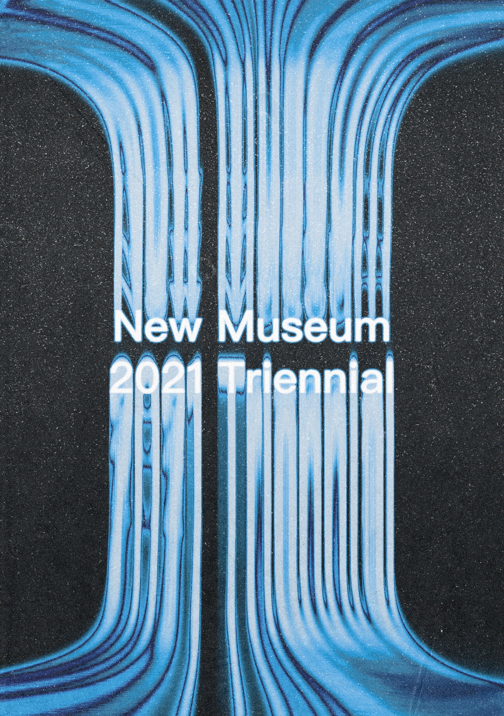
The catalogue's back cover: the poured, dripping form printed in blue on black speckled stock, with “New Museum 2021 Triennial” set in white across the middle.

The final project was to make prototype website for the show that followed the theme we had been cultivating throughout the semester. I used Figma to make a basic UI for a website that shared all the information about the show and the projects I had done for the show as well information regarding sponsors and artists. The background for the website is a scrapbook like collage of my favorite pieces from the show that are edited in the same blue gradient mapping to match the initial poster.
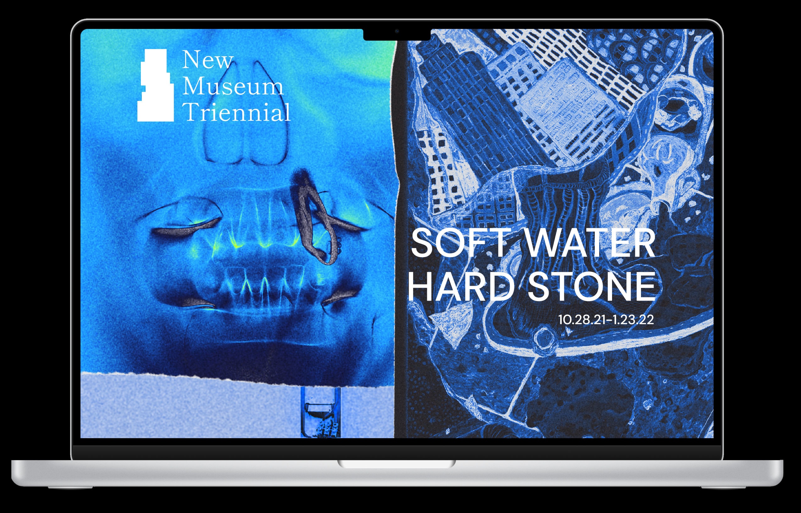
Website PrototypeOpen in Figma
A laptop mockup of the exhibition website: the New Museum Triennial identity on a blue image panel at the left and “SOFT WATER HARD STONE, 10.28.21–1.23.22” in white type over a dark blue collage on the right.