Skip to content

Path Penn Project

This project asked students to reimagine the course registration process and website used at the university.

Brand & Design

Path@Penn Redesign

This project asked students to reimagine the course registration process and website used at the university. Students were asked to conduct user research through their peers to identify major pain points within the registration process and use those insights to propose a revised website for the university.

User Research

Insight Statements:

Path@Penn provides many functions that users never access.

Students heavily value the opinions of previous students enrolled in the courses they are considering.

The landing page is rarely used, but users still complain about the layout.

The tab system has many shortcomings that slow down users.

The calendar function is valuable but is confusing to users.

How Might We Statements

How might we streamline the navigation of course search.

How might we make searching for courses more intuitive and quicker for users.

How might we provide students the information they value when considering a course.

How might we make the landing page highlight the primary functions while still allowing easy access to less frequented tabs.

How might we reduce extra work for user by providing the functions they want.

Wireframes

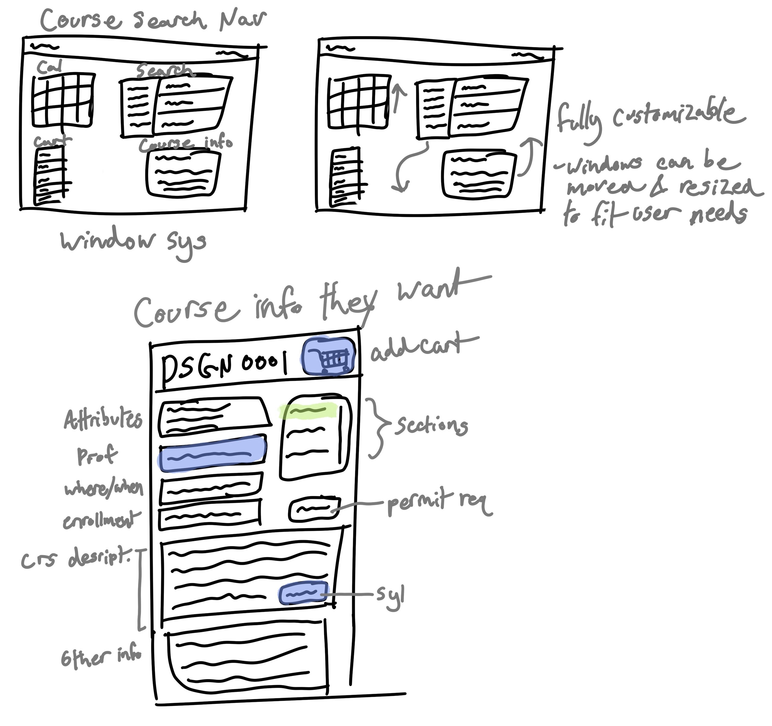
Hand-drawn pencil sketches working out a movable, resizable window system for course search and course information, annotated with notes on attributes, sections, professor, when and where, enrolment, permit requirements and syllabus.

This sketch was the core of my design and revolved around redesigning the expanding tab system currently used by the universities website. This tab system required users to navigate through a series of expanding windows that could not easily be returned to since returning to an earlier tab closed all expanisions. A major issue students were encountering was difficulty comparing courses since course information could not easily be swapped between. The solution I propose was switching to a moveable window system that allows users to have multiple windows open of only the information they deem important. This would allow users to control what information is most prominetn when conducting their course search.

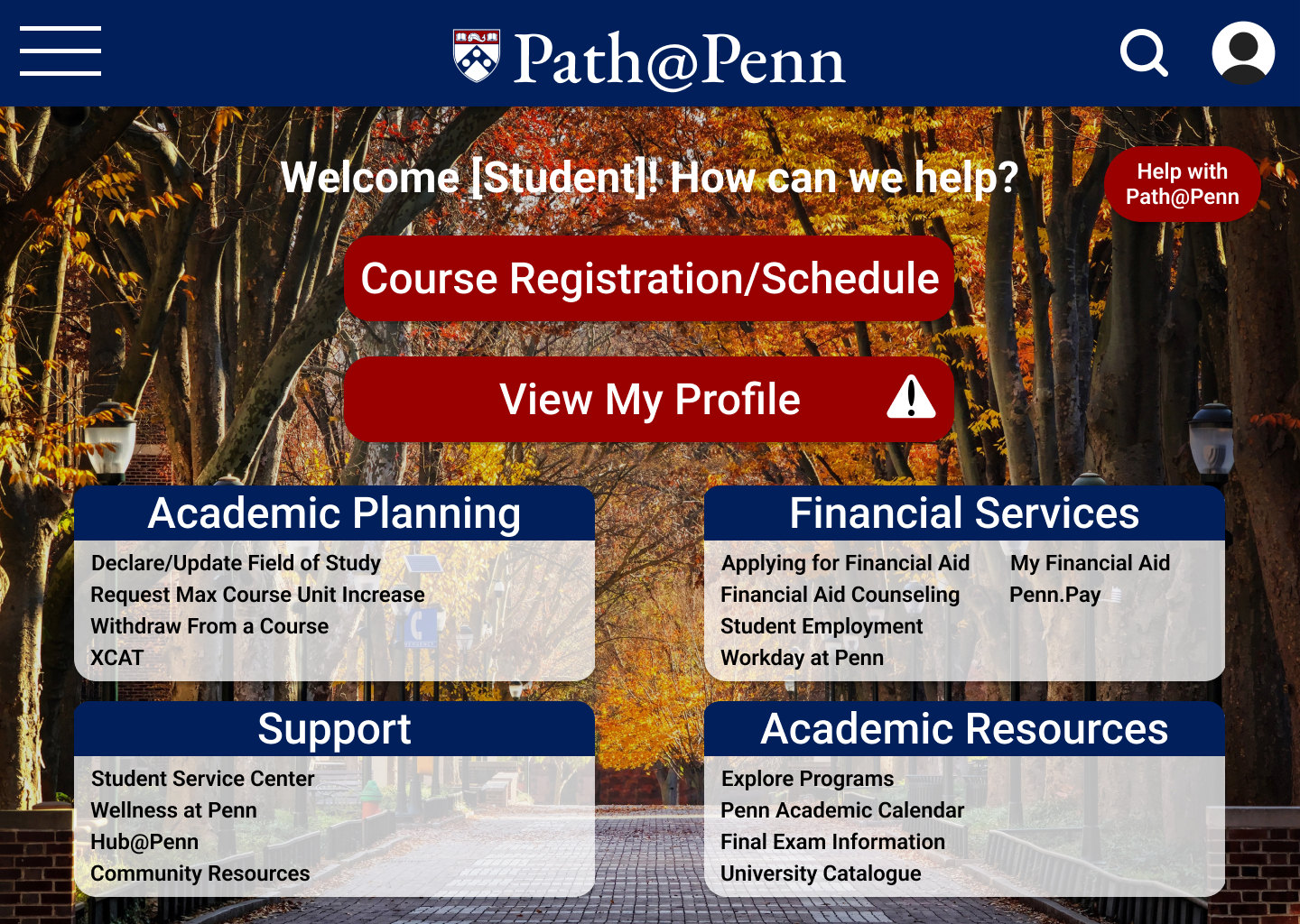
A greyscale wireframe of the Path@Penn welcome screen: “Welcome [Student]! How can we help?” above Course Registration/Schedule and View My Profile buttons, with four grouped panels for Academic Planning, Financial Services, Support and Academic Resources.
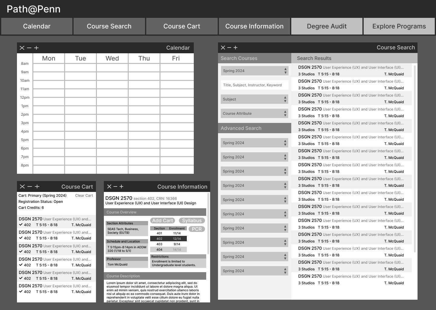
A greyscale wireframe of the multi-window course workspace, showing the calendar, course search results, course cart and course information panels tiled together.

Homepage

The welcome screen in Penn branding, set over a photograph of campus in leaf, with the Course Registration/Schedule and View My Profile buttons in red and the four resource panels below.
The redesigned Path@Penn welcome screen over a photograph of a tree-lined campus walk in full autumn colour: “Welcome [Student]! How can we help?” above red Course Registration/Schedule and View My Profile buttons, with Academic Planning, Financial Services, Support and Academic Resources panels beneath.
The same welcome screen with its background photograph swapped for a snow-covered quad and roofline, showing the four translucent link panels holding their contrast over a much paler image.
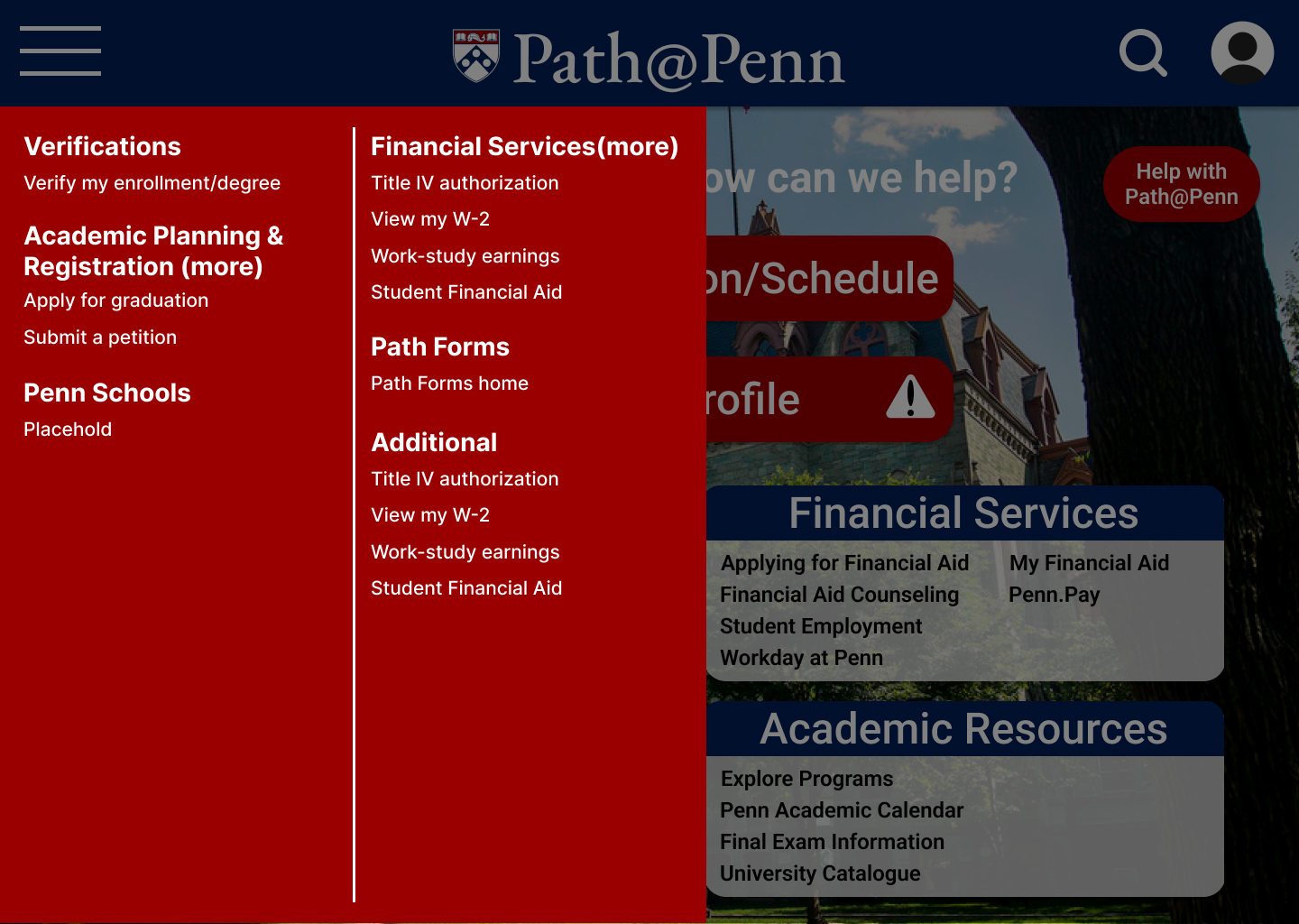
A full-height red mega-menu opened over the welcome screen, listing Verifications, Academic Planning & Registration, Penn Schools, Financial Services, Path Forms and additional links in two columns.

Course Search

Course View

The course workspace before anything is added: an empty weekly calendar, an empty cart, and the Course Search panel with its filter fields and a list of results.
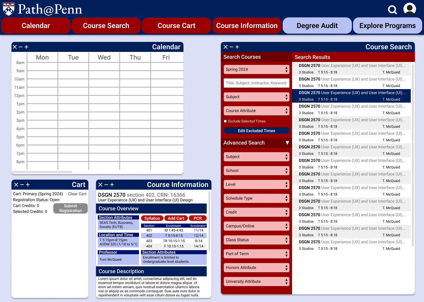
The course workspace with Course Information opened: an empty weekly calendar and an empty cart on the left, and on the right DSGN 2570 section 402 broken out into section attributes, meeting times, professor Tom McQuaid and description, beside the Course Search filters and results.
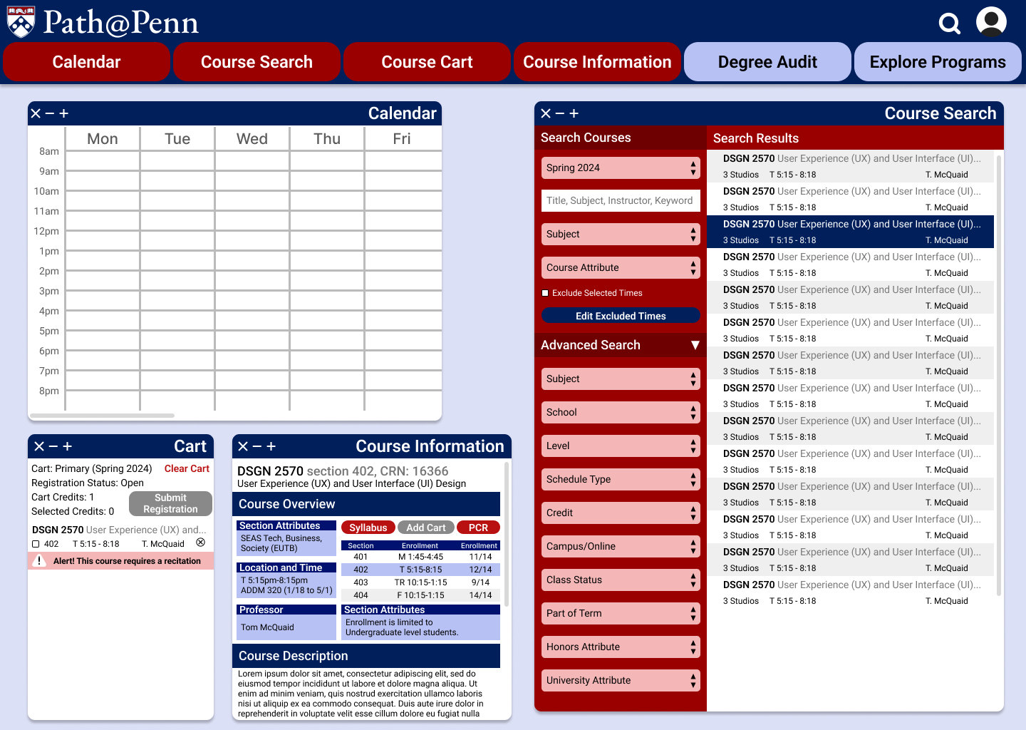
The workspace with a single unchecked course in the cart and a pink inline warning directly under it reading “Alert! This course requires a recitation”, while the weekly calendar is still empty.

Confirmation Screens

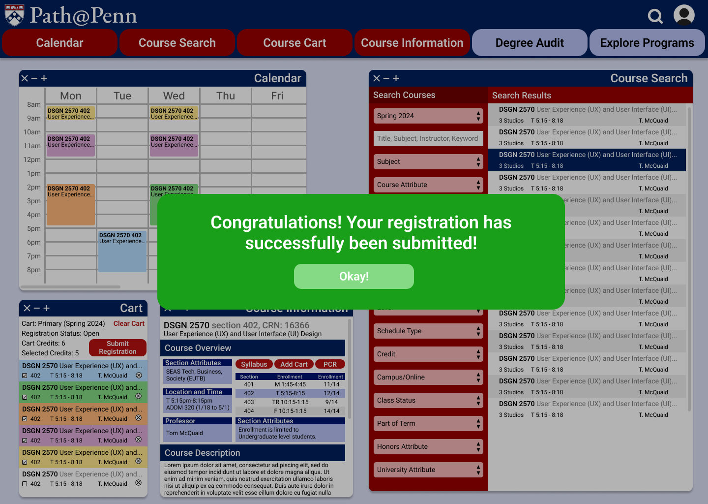
The workspace with a green confirmation banner reading “Congratulations! Your registration has successfully been submitted!” above an Okay! button.
The confirmation step for a single course: “You’re about to remove [COURSE NAME] from your cart, are you sure you want to do this?” with a green Remove Course button beside the red “No Take Me Back!”.
The confirmation step before emptying the cart: “You’re about to clear your cart, are you sure you want to do this?” with a green Clear Cart button beside the same red “No Take Me Back!”.
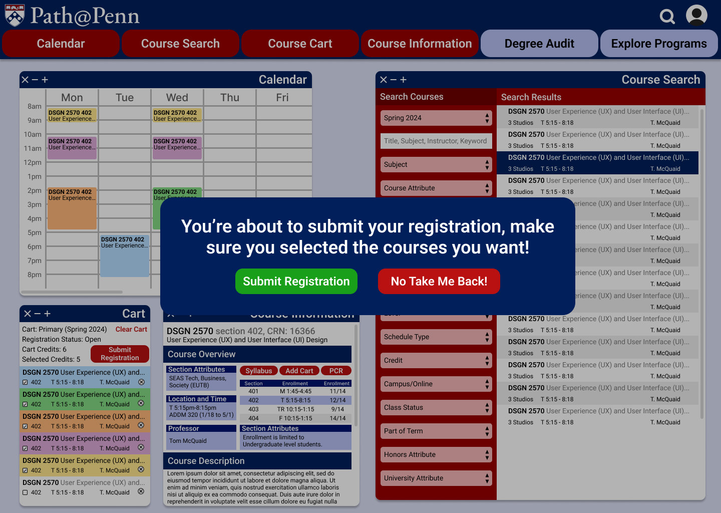
The confirmation step before registering: a dark rounded dialog reading “You’re about to submit your registration, make sure you selected the courses you want!” with a green Submit Registration button and a red “No Take Me Back!”, over a filled calendar and a six-course cart.

Final Schedule View

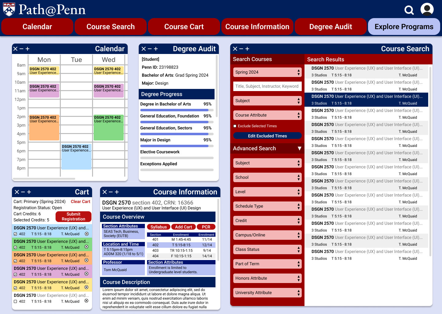
The Degree Audit panel open in the workspace, showing degree progress as percentages against requirements such as Degree in Bachelor of Arts, General Education Foundations, General Education Sectors, Major in Design and Elective Coursework.
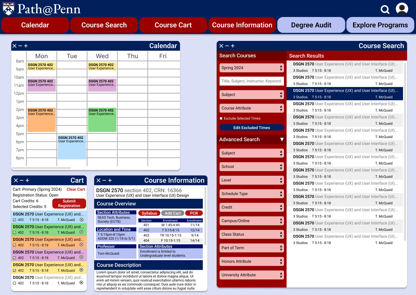
The redesigned Path@Penn course workspace: a weekly calendar filled with colour-coded course blocks on the left and a Course Search panel of results on the right, under a red navigation bar with Calendar, Course Search, Course Cart, Course Information, Degree Audit and Explore Programs tabs.