Skip to content

WhatsApp Redesign

For this project, students were asked to take on the research, synthesis, UX, and UI design of a digital experience of our choosing.

Brand & Design

For this project, students were asked to take on the research, synthesis, UX, and UI design of a digital experience of our choosing. We were allowed to choose between an original concept or a redesign of an existing product

Research

Background/Inspiration

This project was inspired by my frequent use of the app WhatsApp because of its international messaging capabilities. Being an international student with family that lives abroad, WhatsApp is an invaluable tool that allows me to communicate with those I’m closest with. After many years of experience with the app, I have noticed multiple features that are frustrating to use and this project was the perfect opportunity to revise these functions.

User Research

The goals of my user research process was to verify that the systems I theorized needed revision were actual pain points for users, as well as identifying any other problems users encountered. The user research was conducted via three interviews and a survey.

Interview Questions

What do you typically use WhatsApp for? One on one messaging, calls or group texts?

Can you describe a time when WhatsApp did not meet your expectations in terms of user experience?

Are there any features or functions you feel are missing from WhatsApp that would enhance your user experience?

How do you perceive the group chat functionality in WhatsApp?

How satisfied are you with the current options for customizing the notification you receive?

How effective do you find the notification system in WhatsApp? Are there any changes you would suggest?

Have you ever experienced difficulty finding a specific feature or setting in WhatsApp? Can you describe the situation?

How do you find the process of searching for past messages or specific content within your chats?

How easy is it for you to navigate between personal chats, group chats, and other sections of the app?

When using the desktop app, how seamless is the transition from mobile to computer? Are there any pain points?

How do you feel about the current layout of WhatsApp? Is there anything you would rearrange or change?

Are there any aspects of WhatsApp's design or user interface that you find particularly pleasing or enjoyable to use?

Survey

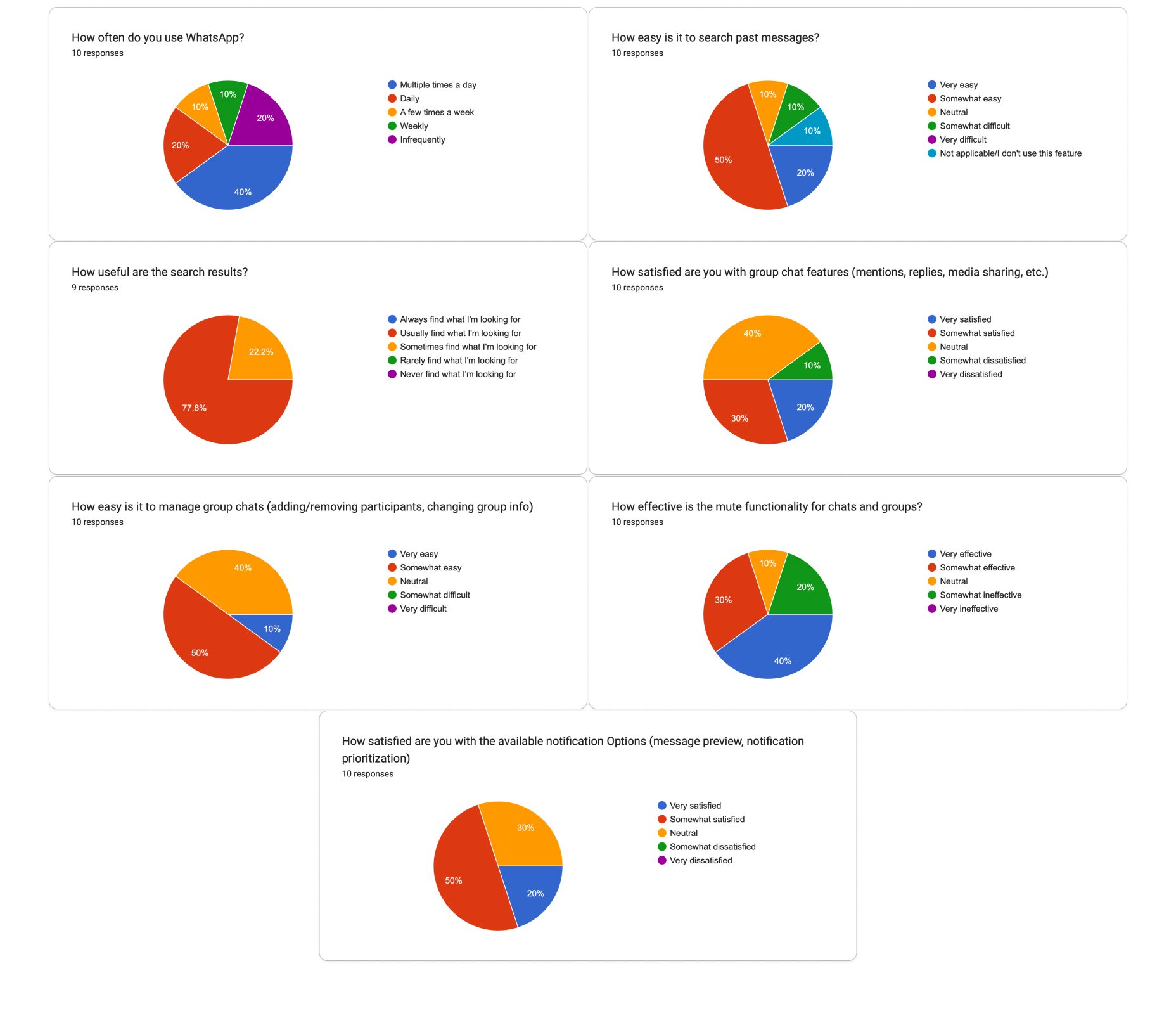
Seven pie charts of survey responses about WhatsApp use, covering how often people use it, how easy it is to search past messages, how useful the search results are, satisfaction with group chat features, difficulty of managing group chats, effectiveness of the mute function, and satisfaction with notification options.

The Problem

User Research Reflections

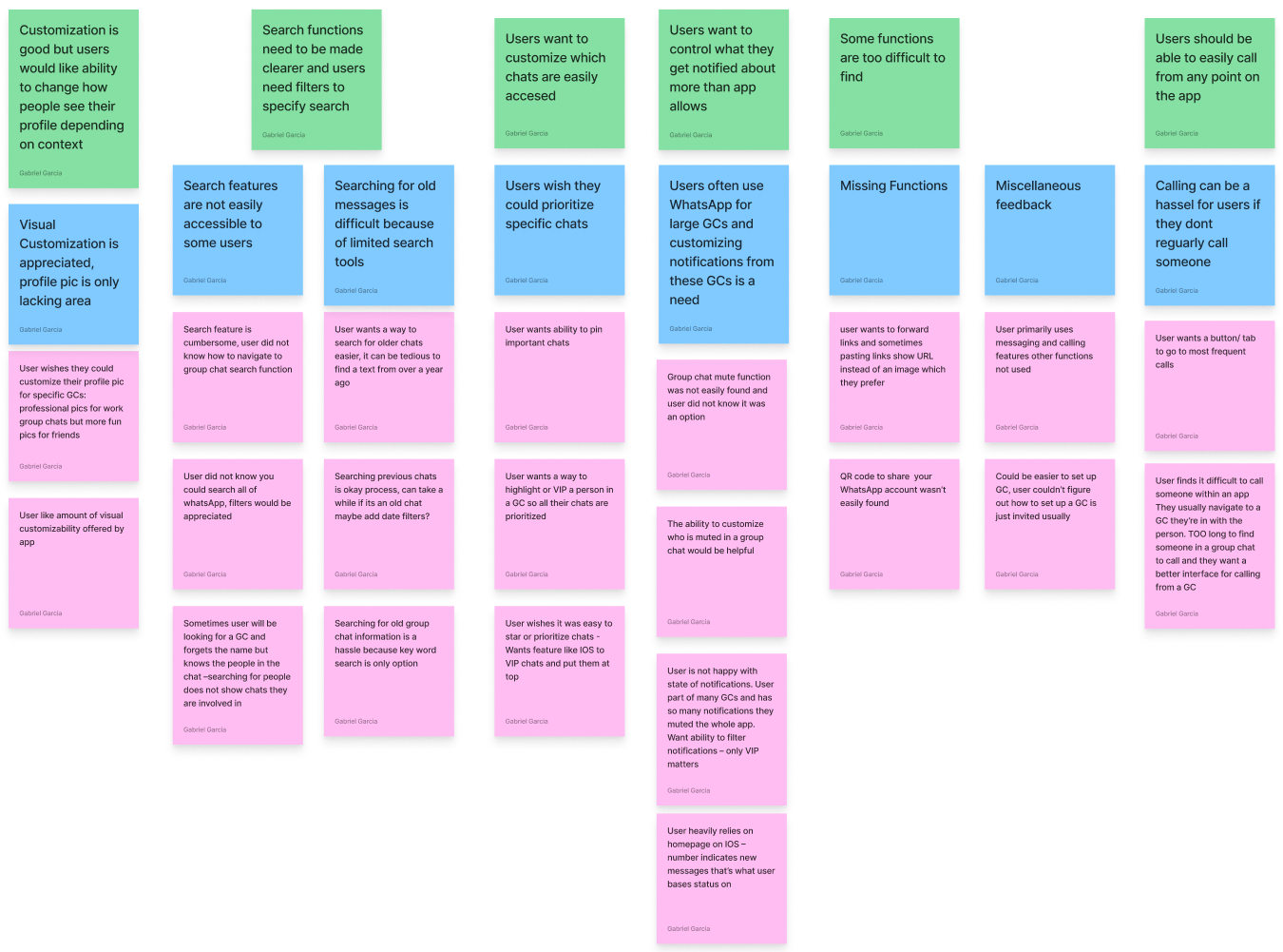
An affinity diagram of green, blue and pink sticky notes grouping research findings into themes such as customisation, search functionality, notification control and missing features.

Insight Statements

As a user who is involved in multiple large GCs I need a way to filter the notifications I get so that only the most important info is seen.

As a user who searches for past messages I need more filters and search tools so that I can narrow my search and more effectively find what I want.

As a user who is involved with multiple GCs I need a way to pin the most important GCs so that I can easily access them over less important but more active GCs.

As a user who primarily uses text and call functions I need them to be emphasized and have more features so that my experience is streamline.

As a user who was unaware of many of the features WhatsApp provides I need clearer options so that I know how best utilize and customize the app to my needs

How Might We Statements

How might we overhaul the search function to allow users more freedom to narrow their results

How might we allow users to have better control over what texts alert them

How might we allow users to access their most important GCs more easily

How might we streamline the primary functions of WhatsApp (text and call) so that users can more intuitively use them

How might we make functions of WhatsApp more clear and accessible to users who are new or were unaware of these tools

Wireframes

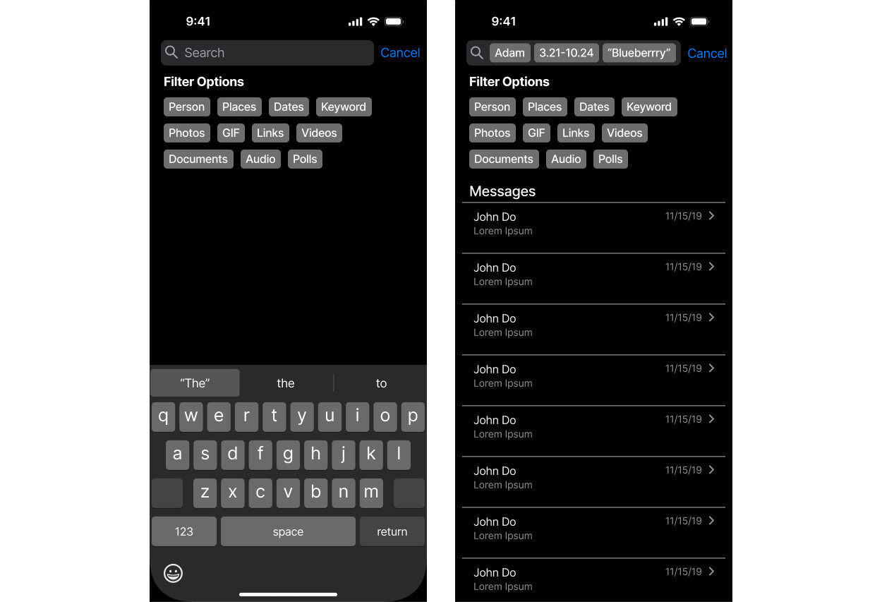
Two dark-mode phone screens showing the redesigned search: one with a row of filter chips — Person, Places, Dates, Keyword, Photos, GIF, Links, Videos, Documents, Audio, Polls — above the on-screen keyboard, and one showing the matching Messages results.
Three dark-mode iOS screens side by side: a Contact Info page for “John Doe” with Audio, Video and Search buttons over a list of chat settings, and two Chats lists split into Favorites and Regular sections.
Two dark-mode phone screens for group chats: a Group Info page for a three-member group, and a “Prioritize Chats” screen listing profiles with a checkbox beside each and a “Mute Non-Priority Chats” option.

User Testing

User #1 | Age 49

How would you search for a message you know was sent by mark and mentioned dogs?

Intuitively used filters to narrow down person and key word

Found it potentially clunky to make users type whole chats or names - suggestion menu would be helpful

Struggled for a little to understand that chat referred to both an individual and GC but ultimately made sense to user

How would you search for a message that’s a photo of you and your mom from 2022?

Immediately used photo filter

Struggled for a bit to figure out how to set date range through typing but eventually understood

How would you mute everyone but mark in this chat?

User struggled slightly to understand prioritizing chat function of emphasizing as opposed to muting

This could be clarified

How would you mute just mark in this chat?

After having used priority system user understood that prioritizing everyone but mark would mute mark

However it would be more intuitive to have a mute and prioritization setting according to user

How would You favorite a chat?

User easily found check box and thought it was a quick process - no major pain points

User #2 | Age 18

How would you search for a message you know was sent by mark and mentioned dogs?

User immediately used search filters for chat and key word

Did not have much feedback, felt process was intuitive and filters did what they expected

How would you search for a message that’s a photo of you and your mom from 2022?

User found typing dates clunky

Photo filter was used intuitively

How would you mute everyone but mark in this chat?

User required clarification on what prioritization did - this is not a typical function of most messaging apps

This section definitely needs explanation

How would you mute just mark in this chat?

User was a little confused at first on how to complete task, but eventually realized they could just mute from contact page

Prioritizing is useful when you only care about a few people but is not helpful when just one person is trying to be muted

How would You favorite a chat?

User easily found check box and thought it was a quick process - no major pain points

User #3 | Age 23

How would you search for a message you know was sent by mark and mentioned dogs?

User had no issues selecting chats and keyword filters for this search

How would you search for a message that’s a photo of you and your mom from 2022?

User intuitively used photo filter

Found typing date system difficult to use and thought it would be helpful to implement a calendar for this

How would you mute everyone but mark in this chat?

User figured out quickly that they had to select mark and then mute all non-priority chats

How would you mute just mark in this chat?

User had no issue realizing they had to prioritize everyone but Mark, however this was because they had just completed the prior task

User also realized they could just mute from marks contact

How would You favorite a chat?

User easily found check box and thought it was a quick process - no major pain points

User Testing Results

Going into these user tests I had three main goals: determine how usable search system is, is the group chat prioritization function intuitive, and is chat favoriting accessible? These user tests very quickly revealed to me that the chat search function needed more polishing to be usable to users. The main complaint I received was that that typing in whole names or dates for filters was clunky, and users want pop-ups that show them suggested results for chats and a calendar for the date. For the prioritization feature, users found the function confusing at first, but once it was explained they felt that it made sense. This menu needed more clarification on what users were supposed to do. The favorite feature was a greatly appreciated function that users found easy to use.

Final Design Solution

Overhauled Search System

The search system functions as an upgrade over the current WhatsApp search tool. Currently WhatsApp only allows users to search by file type and through phrases. This new search system still includes these features, but gives users the ability to search specifically by user and date.

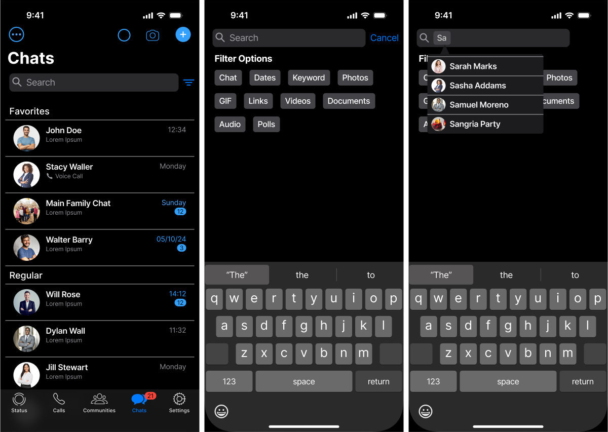
Three dark-mode phone screens: a Chats list divided into Favorites and Regular, a Filter Options panel offering Chat, Dates, Keyword, Photos, GIF, Links, Videos, Documents, Audio and Polls, and a search narrowed to named contacts shown as removable chips.
The desktop layout with a date filter open: a January 2024 calendar picker sits over the chat list on the left while a conversation with message bubbles stays visible on the right.
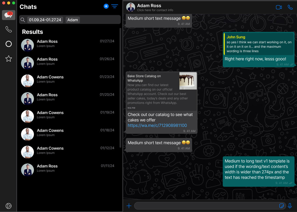
The desktop search carrying two filters at once — a date-range chip reading 01.09.24-01.27.24 and a name chip reading Adam — returning Adam Ross and Adam Cowens dated between 01/11/24 and 01/27/24, with Adam Ross's conversation and its bakery catalogue card open on the right.
The desktop layout with the full Filter Options list expanded down the left column — Chat, Dates, Keyword, Photos, GIF, Links, Videos, Documents, Audio, Polls — beside an open conversation.
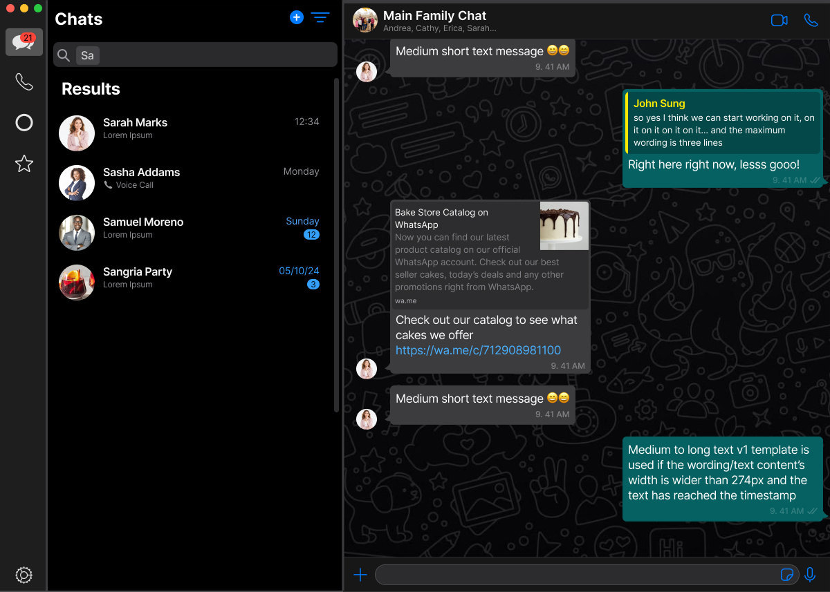
The desktop search part-typed as “Sa”, already returning Sarah Marks, Sasha Addams, Samuel Moreno and the Sangria Party group in one Results list, with the Main Family Chat conversation still open in the right-hand pane.

Favorite Chat System

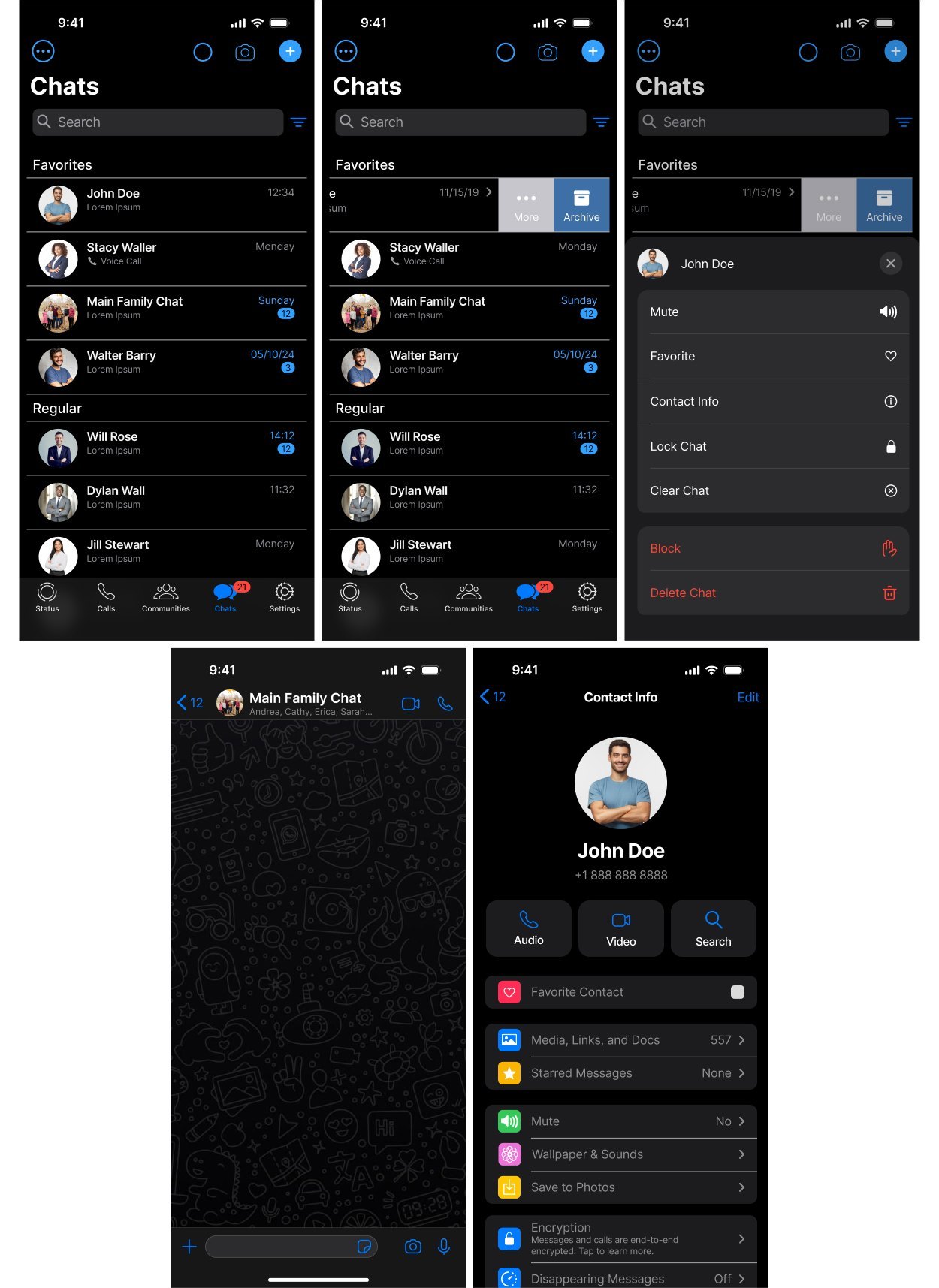
Unlike many messaging services, WhatsApp does not include a favorite system that allows users to have chosen chats always at the top of their app. These screens show what this favorite system would look like for users and the two ways they can access it.

Five phone screens for the favourite system: the chat list split into Favorites and Regular; a row swiped open to reveal More and Archive; the menu that swipe opens, offering Mute, Favorite, Contact Info, Lock Chat, Clear Chat, Block and Delete Chat; an empty Main Family Chat thread; and John Doe's Contact Info carrying a “Favorite Contact” toggle.
The desktop contact card for John Doe open over the chat list — his photograph, +1 888 888 8888, Audio, Video and Search buttons, and a “Favorite Contact” toggle switch sitting at the top of the settings list.
The desktop layout with a per-chat context menu open over the chat list, offering Mute, Favorite, Contact Info, Lock Chat and Clear Chat above destructive Block and Delete Chat actions in red.

Priority Chat System

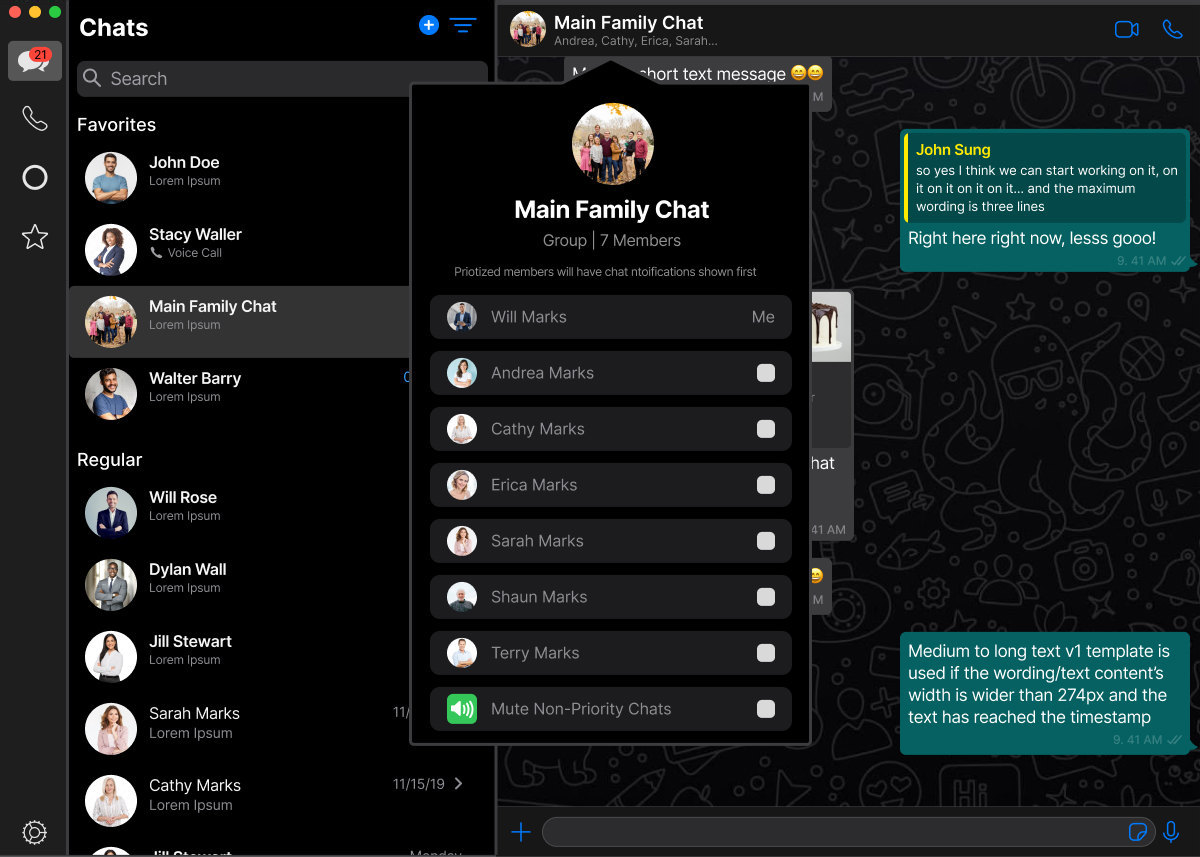
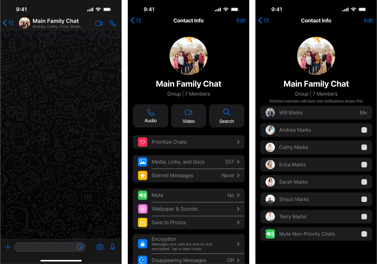
This is function is the only one not commonly used by other messaging services, however I received user feedback that WhatsApp needs to allow users to better manage their large groups. This function aims to allow users to only be notified by messages they care about from group chats. By prioritizing members of a group chat, their messages will always be shown first in notifications and when looking at the group in the app. This function is not supposed to a mute feature, but instead allow users who are in large or many group chats to filter what they are notified about without muting a whole group.

Three phone screens for the priority system: the Main Family Chat conversation open on the doodle wallpaper; the group's Contact Info with a pink-iconed “Prioritize Chats” row above Media, Links and Docs; and the prioritise list itself, where Will Marks is marked “Me” and Andrea, Cathy, Erica, Sarah, Shaun and Terry Marks each carry a checkbox, ending in “Mute Non-Priority Chats”.
The desktop group card for Main Family Chat with every member listed under the line “Priotized members will have chat ntoifications shown first”: Will Marks as “Me”, then Andrea, Cathy, Erica, Sarah, Shaun and Terry Marks with a checkbox each, and “Mute Non-Priority Chats” last.
The desktop group card for Main Family Chat before anyone is prioritised: the group photograph, “Group | 7 Members”, Audio, Video and Search buttons, then “Prioritize Chats” as the first row, above Media, Links and Docs at 557 and Starred Messages at None.