The brand system
Nobody handed me a brand guide, so apart from Himedi’s blue, every color and font on the site was my decision.
In the brief, our CEO pointed to how longevity competitors like Function Health, Superpower and Whoop talk about their product and mission. I gave the brand a clinical, modern look to match, with deep navy backgrounds behind the imagery.
I cut the type down to two typefaces and nine text styles, with smaller sizes for the larger styles on phones.
The light focus-area colors were too pale for white button text, so I made a deeper version of each.
Typography
I chose Inter for headings, prices and controls, and DM Sans for body text.
Show the type scaleHide the type scale
- Inter
- Headings, prices, buttons and navigation
- DM Sans
- Body copy, and the default on every page I redesigned
- Display · 74px · 40px on phones · Hero headlines
Insights to shape your best life
- H1 · 40px · 30px on phones · Section and page headlines, builder prices
Why book through Himedi.
- H2 · 24px · 20px on phones · Card and panel titles, stats, totals
The clinic’s price, or less.
- Body large · 17px · 15px on phones · Ledes, card copy and quotes
A checkup in Seoul, $299
- Label · 15px · 14px on phones · Buttons, navigation, tabs and options
Build my checkup
- Body · 14px · Body copy, panels and footer links
A checkup in Seoul, $299
- Body small · 12px · Notes, descriptions and legal
Typical saving. Varies by clinic and package.
- Label small · 12px · Test chips, figures and the stepper
Complete blood count
- Eyebrow · 12px · Eyebrows and section labels
Your checkup
Color
I kept Himedi’s blue as the main color and built the rest of the palette around the blue. The navies became the dark surfaces under photography and scans. I kept three accent colors for the focus areas a customer picks in the checkup builder.
Blue
Himedi blue
#51749bPrimary button fill, cart badge, links
Blue deep
#3f5c7cPrimary button hover, focus ring on light
Blue light
#7ea3ccSupporting blue
Blue glow
#9ccbf2Highlight figures on dark cards
Teal
#5fb6c4Focus ring on dark surfaces, live indicator
Teal text
#2c7a87Teal made readable as text on light
Gold
#e3b765Warm accent, shared with the cancer focus area
Navy
Navy 900
#0a1726Deepest surface, fixed header
Navy 850
#0c1d30Dark surface
Navy 800
#102438Dark surface, and the label on light buttons
Navy 700
#16314eDark surface step
Navy 600
#1e4067Lightest navy, hero glow
Light surfaces and text
Light
#f3f7fbPage background
Light 2
#e8f0f8Behind every media box
Light warm
#f7f9fbAlternate light surface
Card white
#ffffffCard fill
Text dark
#0f1b2dBody text
Text soft
#33485fSecondary text
Text muted
#5a6f88Tertiary and caption text
On dark
#eef4fbText on navy
On dark soft
#c2d2e6Body copy on dark image cards
On dark mute
#90a6c2Tertiary text on dark
The three focus areas
Heart
#e0846fHeart focus area
Brain
#8e7cc3Brain focus area
Cancer
#e3b765Cancer focus area
The same three, deep enough for a button
Heart deep
#b64227Fill on the heart card’s Add button
Brain deep
#7059b3Fill on the brain card’s Add button
Cancer deep
#886119Fill on the cancer card’s Add button
Imagery
I used three kinds of imagery, each in its own part of the site.
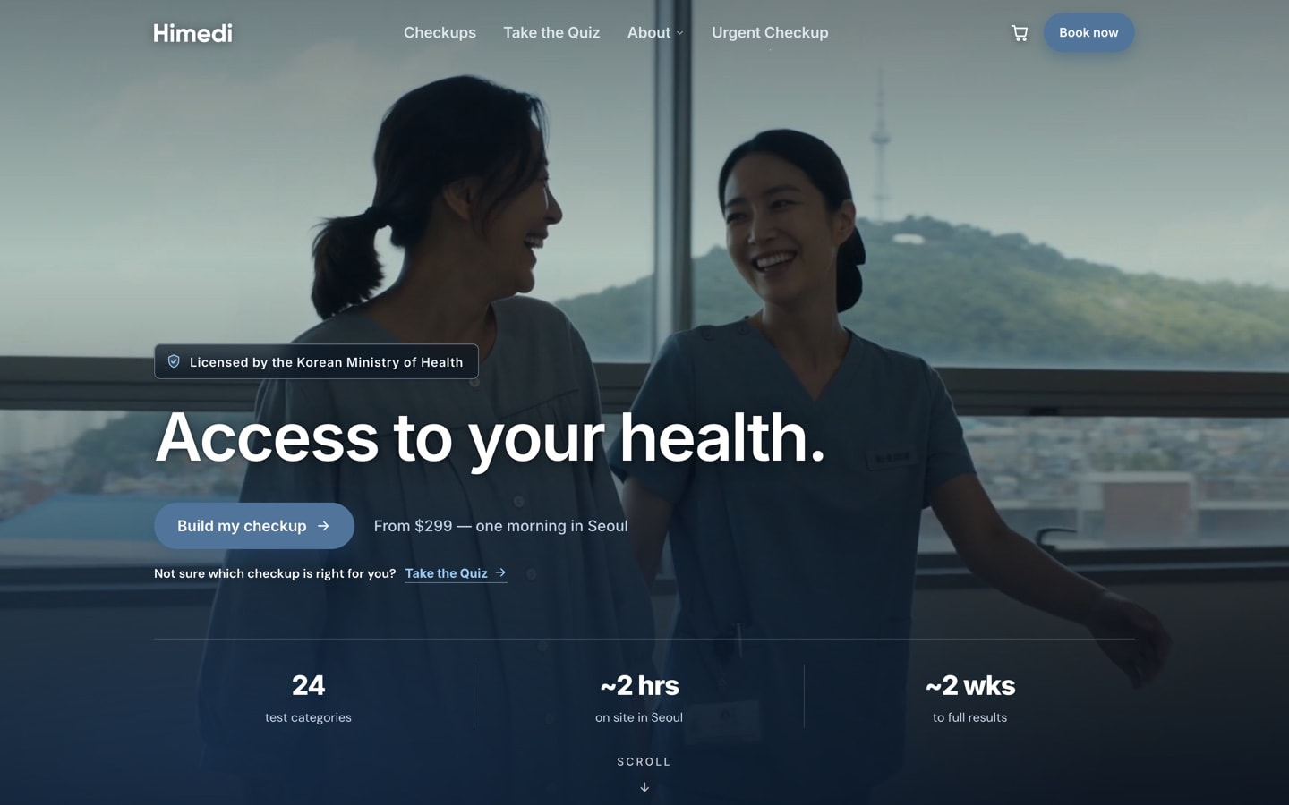
Documentary
I wanted the people in the photos to look caught mid-morning at a clinic, with nobody facing the camera. Much of the imagery was enhanced with AI, and all of it was graded a cool gray-blue.
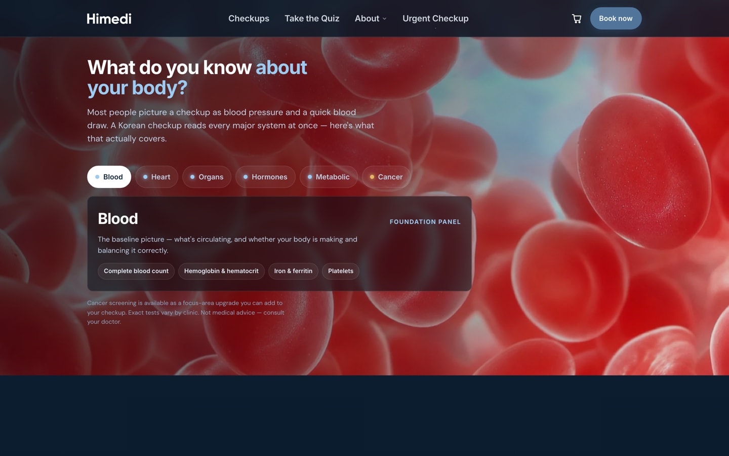
Abstract biology
In the dark section about the body, I kept the biology close-ups photoreal. The image changes with the tab a visitor picks.
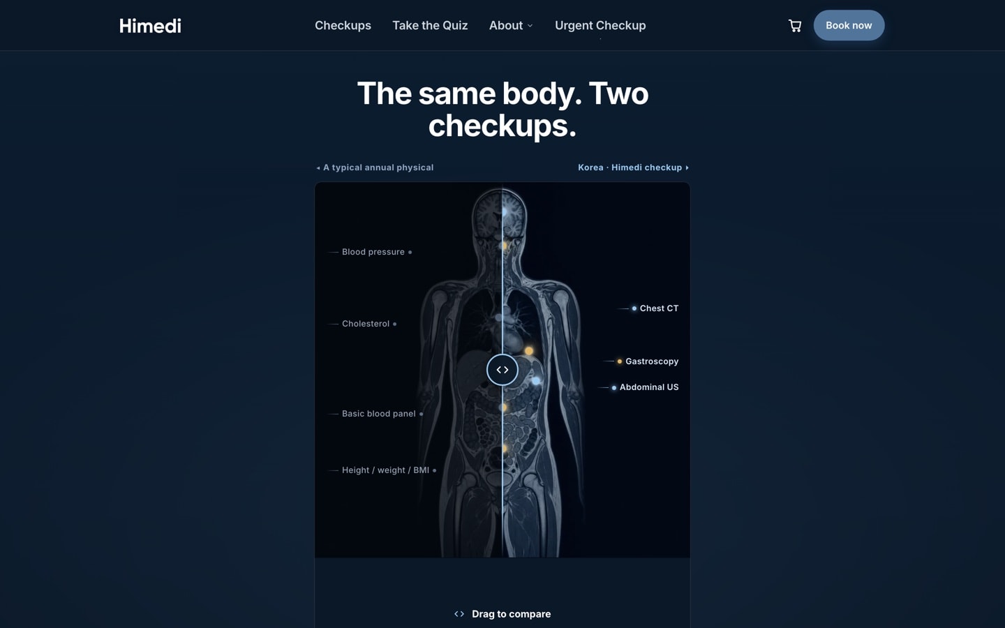
Diagnostic output
Behind the slider that compares an American physical with a Korean checkup, I put a whole-body scan in cold blue-white on near-black. That section made the case that a checkup in Korea was worth the trip.