Two audiences, one brand
The founders wanted travelers who would have us plan the whole trip, without losing customers who only wanted a checkup. So I built one warm base for everyone and gave the darker concierge pages their own gold and a second serif.
I took the cues from luxury hospitality and private clinics, where the service is the product. That meant warm serifs, cream and sand in place of clinical white, and photography of people and quiet, warmly lit rooms.
Typography
I set the headlines in Lora. It replaced Playfair Display, whose italic J cut through “Journey” in the concierge headline. I used DM Sans for the interface and prices, and Cormorant Garamond for the concierge page’s longer text.
Show the type scaleHide the type scale
- Lora
- Headlines, section and card titles, and the navigation
- DM Sans
- Body copy, prices, buttons and labels
- Cormorant Garamond
- Body copy on the concierge page
- Display · 72px · The concierge headline and full-width banners
Your Health Journey, Elevated
- Page title · 54px · Page headlines
Premium Healthcare. Personally Curated.
- Section · 40px · Section headlines
How We Work With You
- Price · 32px · Checkup prices
$2,815
- Card title · 28px · Card titles and the three promises
Expertly Vetted Care
- Body · 18px · Body copy across the marketplace
We personally select each clinic through rigorous, on-the-ground vetting.
- Concierge body · 18px · Body copy on the concierge page
A private experience combining Korea’s finest medical care with seamless service.
- Eyebrow · 11px · Uppercase labels, tracked wide
HIMEDI CONCIERGE
Color
I kept Himedi’s blue and warmed up everything around it, so the site felt more like a private clinic than a pharmacy. The concierge pages swapped that warm base for near-black and gold, and gold appeared nowhere else.
Marketplace
Cream
#fffdfaPage background
Sand
#f9f4e8Alternate section background
Brown
#4a3f36Headlines and body text
Himedi blue
#51749bButtons, links and the closing bands
Concierge
Near-black
#1a1a1aConcierge text and dark sections
Gold
#c4a77dThe italic accent, eyebrows and the call button
Gold dark
#9d8167Button hover and small labels
Linen
#f8f6f3Light sections on the concierge page
Imagery
I generated the site’s photography with AI, except the founders’ portrait, which was a real photo I enhanced with AI. Each of the three kinds of image had one job.

Portraits
The homepage opened with slow portrait videos of calm faces against warm sand, so visitors saw a person before a clinic.
Spaces
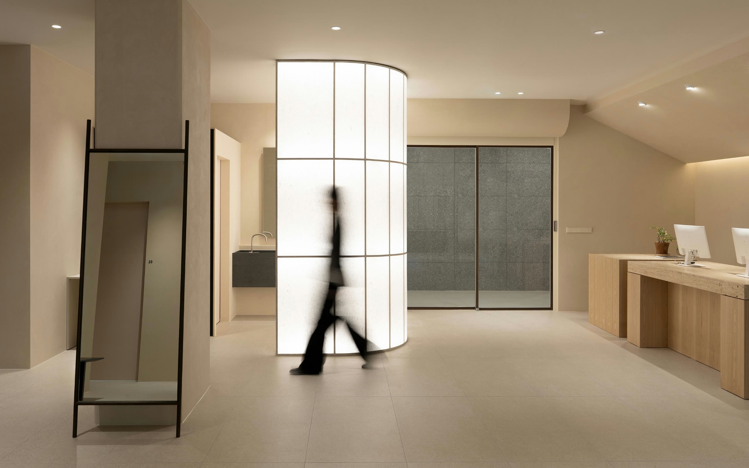
The concierge page used photos of warmly lit, nearly empty interiors.

Moments
I used everyday details, like a laptop on a knee or a cup by a sofa, to illustrate each step of working with us.